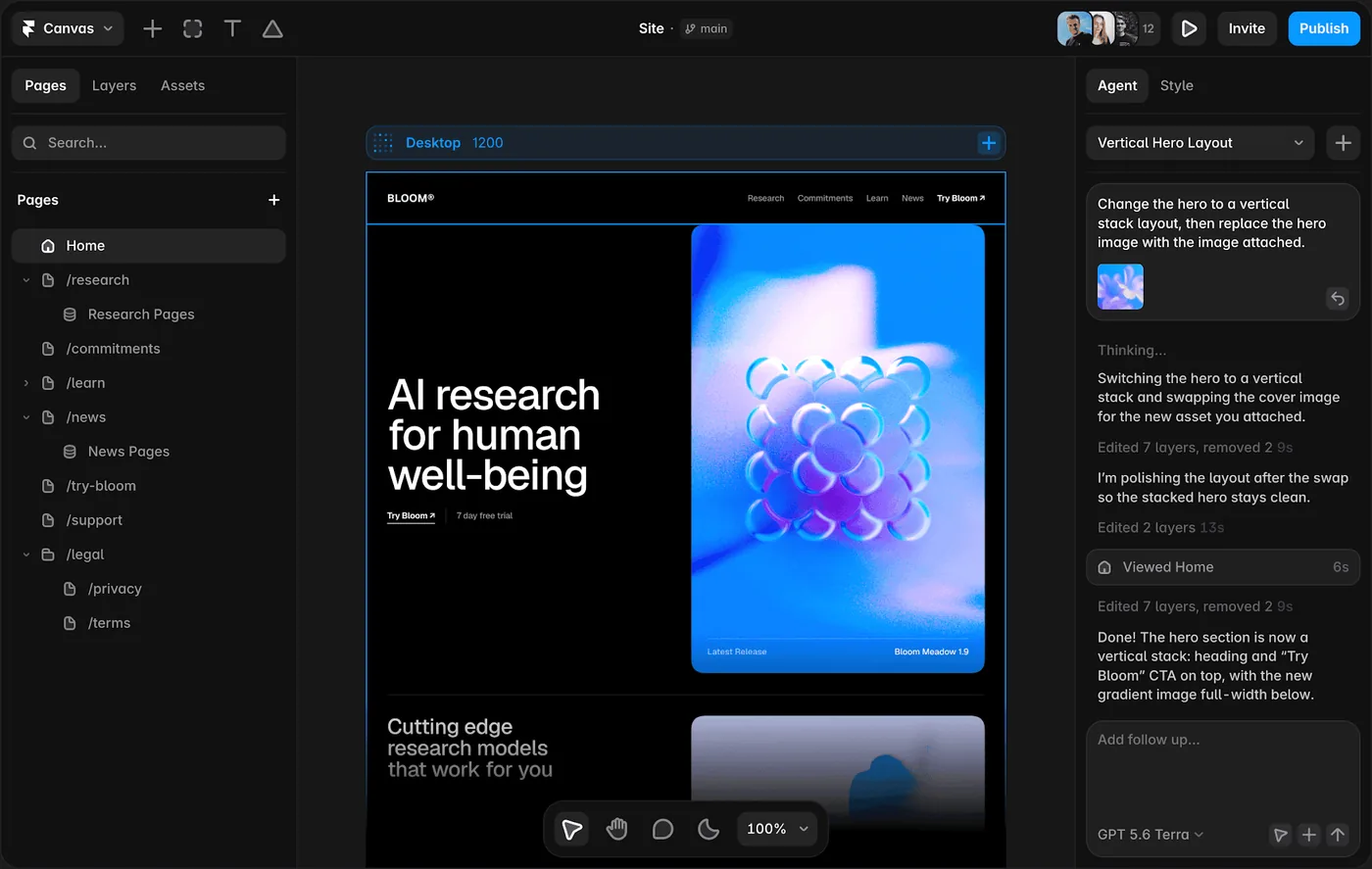
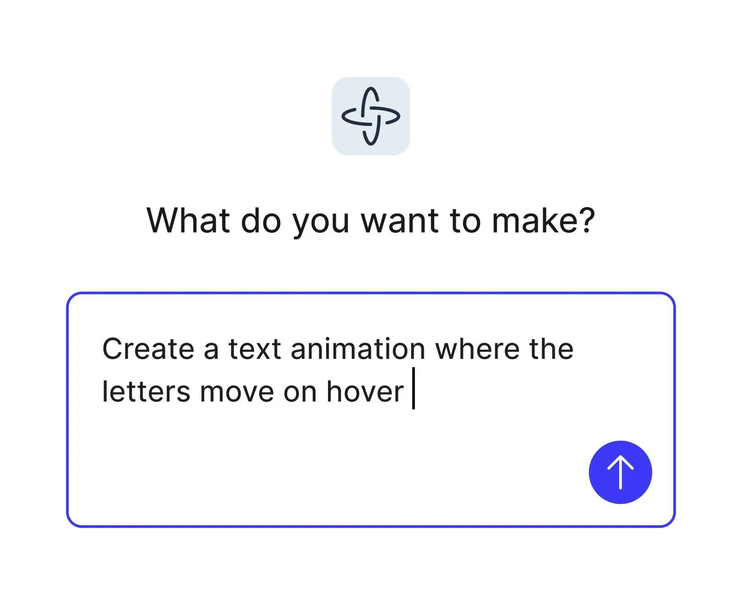
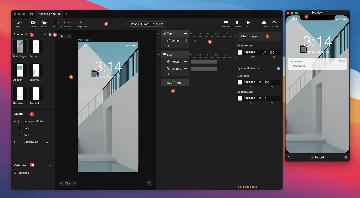
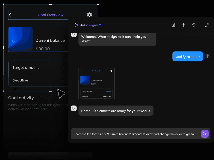
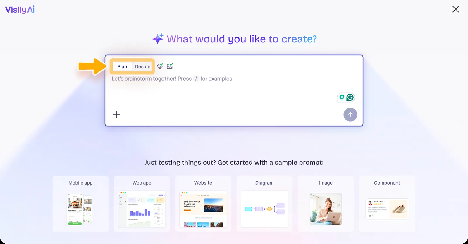
The hard part of wireframing is no longer drawing rectangles.
An AI wireframe generator can turn a prompt into screens in seconds. The useful question is what happens next. Can you edit the structure? Generate another screen without losing consistency? Switch between low and high fidelity? Share it with stakeholders? Move it into Figma? Turn it into a prototype or code?
We kept this list to six tools that have a clear place in a real product workflow.
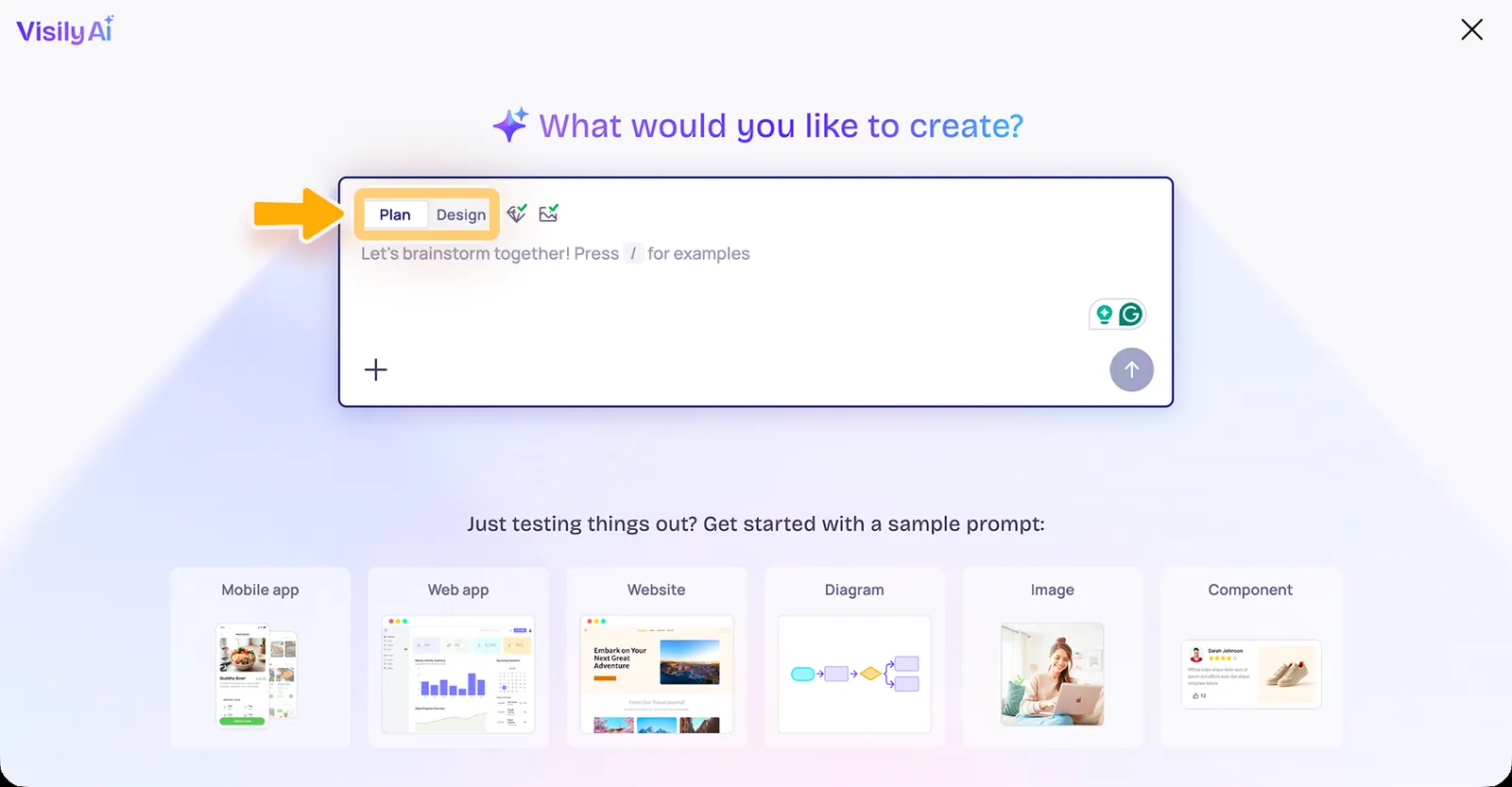
Visily — best overall AI wireframe generator for cross-functional teams
Uizard — best for beginners and fast app concepts
Relume — best AI website wireframe generator
UX Pilot — best for UX-focused wireframes and flows
Google Stitch — best for fast AI-generated multi-screen UI
Figma Make — best for wireframes that need to grow inside Figma
1. Visily: Best Overall AI Wireframe Generator for Product Teams
Best for: PMs, founders, designers, and stakeholders creating editable product flows together
Visily is strong because AI generation is only one part of the workflow. You can create screens, switch between low- and high-fidelity modes, build interactive prototypes, use templates, and keep the result editable. Paid plans add Figma import/export and code export.
The Starter plan is free. Pro is currently $11 per editor/month billed annually and includes 3,000 AI credits per editor/month, unlimited boards, AI deep design, Figma import/export, code export, and Visily MCP.
Why it ranks first: it stays useful after the first generation. A PM can sketch a flow, a designer can refine it, and the team can move it toward Figma or code.
Best for: SaaS screens, dashboards, mobile/web app flows.
Watch out for: professional design teams may still prefer Figma as the final source of truth.
2. Uizard: Best AI Wireframe Generator for Beginners
Best for: Founders, marketers, students, and non-designers who want a concept on screen quickly
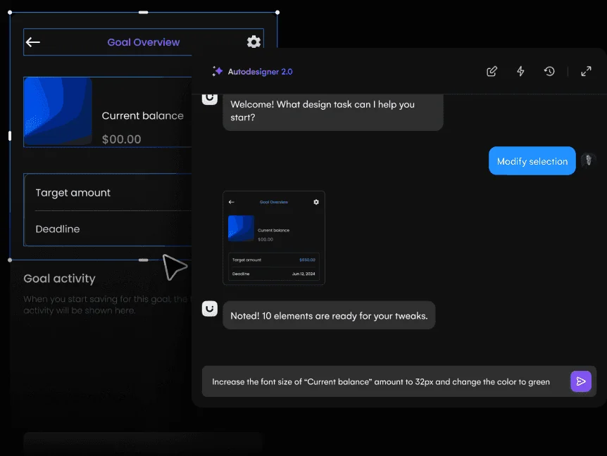
Uizard made prompt-to-interface generation approachable early, and Autodesigner remains its defining workflow. You can start from a text description, generate screens, work with templates, wireframe, add interactions, and hand designs to developers.
The Free plan includes three AI generations per month and two projects. Pro is currently $12/month billed annually with 500 AI generations per month, up to 100 projects, private projects, and React/CSS developer handoff.
Why choose it: the learning curve is low and the tool is built around getting from idea to visual quickly.
Best for: first-pass mobile apps, web apps, stakeholder mockups.
Watch out for: limited free AI generations make the free plan more of a trial than a high-volume workflow.
Best for: Agencies and web teams that need a sitemap and page structure before visual design
Relume starts one level above the individual screen. Give it a website brief and it can generate a sitemap, then turn the pages into wireframes. That sequence is valuable because website projects often fail at information architecture before they fail at visual design.
Instead of asking AI to decorate a homepage, Relume helps teams decide what pages and sections should exist. From there, the work can move into Figma or Webflow.
Why choose it: sitemap → wireframe is a more disciplined website-planning workflow than one-shot page generation.
Best for: marketing sites, SaaS websites, agency client projects.
Watch out for: it is less suited to complex application flows than product-focused tools.
Best for: UX designers who want AI generation alongside flow thinking and UX evaluation
UX Pilot is useful when wireframing is part of a larger UX process rather than a one-off deliverable. It supports AI-assisted wireframes and UI generation while keeping attention on user flows and product decisions.
That makes it a stronger fit for UX practitioners than generic AI site builders. You are not only asking for a pretty screen; you are exploring how a user moves through the product.
Why choose it: UX-specific workflow and Figma-oriented handoff.
Best for: onboarding, SaaS flows, mobile product concepts.
Watch out for: teams that want a deployable app from the same prompt should look at code-first builders instead.
5. Google Stitch: Best for Fast Multi-Screen UI Exploration
Best for: Teams that want to generate and compare UI directions rapidly
Google Stitch is more than a low-fidelity wireframing tool, but it belongs here because of how quickly it can turn intent into connected interface concepts. It is useful when the team wants to explore multiple screens, refine the direction conversationally, and then move toward Figma or frontend code.
Why choose it: speed and UI-specific generation.
Best for: web/mobile interface exploration and multi-screen concepts.
Watch out for: if your definition of wireframe means deliberately rough, low-fidelity structure, Visily, Relume, or UX Pilot may keep the team focused on structure more effectively.
Best for: Product teams that want AI generation without creating a disconnected design artifact
Figma Make can use existing Figma designs and components as prompt context, generate functional prototypes/web apps, and let teams copy generated results back into editable Figma design layers. That makes it a strong choice when a rough AI concept needs to mature inside an established design system.
Figma’s current Starter plan is free with limited AI access. Professional full seats are $16/month and include 3,000 AI credits/month.
Why choose it: continuity with Figma libraries, collaboration, and handoff.
Best for: teams with an existing Figma system.
Watch out for: if all you need is a quick low-fi wireframe, Figma’s broader environment may be more than you need.
For product teams with non-designers involved, start with Visily. For a beginner who wants a quick app concept, Uizard. For websites, Relume. For UX-heavy product discovery, UX Pilot. For rapid AI UI exploration, Google Stitch. For an established Figma team, Figma Make.
Do not judge these tools on the first screen. Use the same three-screen prompt in each tool, then change one requirement. The winner is the tool that keeps the flow coherent after iteration.
Visily is the strongest all-around pick for cross-functional product teams because it combines AI generation with editable wireframes, prototypes, hi-fi/lo-fi modes, and a path to Figma/code. The best choice changes by workflow: Relume is better for websites and Figma Make is better for teams already centered on Figma.
Can ChatGPT generate wireframes?
A general AI assistant can help define screens, content hierarchy, and flows, but a dedicated wireframing tool gives you an editable canvas, reusable components, interactions, and handoff workflows.
What is the best free AI wireframe generator?
Visily and Uizard both have free plans, while Google Stitch is attractive for rapid AI UI experimentation. Limits and availability should be checked before publication.
Can AI turn a screenshot into a wireframe?
Several modern AI design tools support screenshot/reference-driven workflows. Verify the exact import mode for the tool you choose because screenshot-to-editable-design capabilities vary by plan and product version.
A prototype used to mean a clickable set of screens. In 2026, that definition is too small.
AI prototyping tools now span a full fidelity spectrum. At one end, they generate wireframes and flows for a product conversation. At the other, they generate working React interfaces, authentication, databases, and deployable applications. The best tool depends on what you need to learn from the prototype.
If you are testing navigation, do not overbuild a full-stack app. If you are testing whether a workflow actually works, static screens may not be enough.
Our top six:
Figma Make — best overall for design teams
Lovable — best for full-stack MVP prototypes
v0 — best for code-first web UI prototypes
Google Stitch — best for fast multi-screen UI exploration
UX Pilot — best for UX-focused ideation and flows
Relume — best for website sitemaps and wireframe prototypes
Figma’s own 2026 AI prototyping guide also separates tools by fidelity, which is the right way to evaluate this category.
1. Figma Make: Best Overall AI Prototyping Tool for Product Teams
Best for: Designers who want prompt-to-functional prototypes with existing Figma context
Figma Make can generate functional prototypes and web apps from prompts while accepting Figma designs and components as context. It supports publishing, Supabase-backed functionality, attachments, planning, and copying generated work back into editable Figma design layers.
The key advantage is continuity. A designer can start from an existing component library instead of asking an AI builder to invent a new visual language every time.
Best for testing: interactions, product concepts, design-system-aware flows.
Not ideal when: you want the prototype to become the production repository immediately.
Best for: Founders and teams testing a product concept that needs real data, auth, APIs, or backend behavior
Lovable is useful when “clickable” is not enough. It can create working web applications through conversation, so a prototype can include application logic instead of only simulated transitions.
That is powerful for testing a SaaS workflow, marketplace concept, internal tool, or customer portal. Stakeholders can interact with something much closer to the intended product.
Best for testing: end-to-end workflows and MVP assumptions.
Not ideal when: you only need to validate information architecture or rough layout; building more can create false confidence and unnecessary complexity.
3. v0 by Vercel: Best for Code-First UI Prototypes
Best for: Technical product teams prototyping web interfaces in React/Next.js
v0 is strongest when the prototype should already speak the language of the implementation. Prompt an interface, iterate on the rendered result, and work with generated frontend code rather than translating a design-only prototype later.
This is especially useful for dashboards, admin tools, SaaS screens, forms, and component-rich web products.
Best for testing: real web UI behavior and component implementation.
Not ideal when: non-technical stakeholders need a traditional design canvas and collaborative UX documentation.
4. Google Stitch: Best for Fast Multi-Screen AI UI Prototyping
Best for: Exploring interface directions quickly before committing to a design system or codebase
Google Stitch is built around generating and iterating on UI. Its value is speed: start from intent, generate interface directions, connect screens into a flow, and move promising concepts toward Figma or frontend code.
That makes Stitch useful in the messy beginning of product work, when the team wants to compare several directions rather than polish one screen for hours.
Best for testing: screen structure, visual direction, multi-screen flows.
Not ideal when: you need a mature design-system source of truth or full application backend.
Best for: UX designers and product teams that want AI to assist with flows, wireframes, UI generation, and UX evaluation
UX Pilot is more focused on the UX process than the “build me an app” category. That makes it valuable when the purpose of the prototype is to reason about a user journey, explore a flow, or move from early wireframes toward higher-fidelity screens.
Best for testing: UX direction, flows, early interface decisions.
Not ideal when: you need production-ready frontend code as the main output.
6. Relume: Best for Website Structure + Wireframe Prototypes
Best for: Agencies, freelancers, and web teams validating sitemap and page structure before visual design
Relume solves a narrower problem exceptionally well. Start with a website brief, generate a sitemap, turn that structure into wireframes, then move the work toward Figma or Webflow.
That is a better prototyping workflow for many marketing websites than jumping directly into polished UI. The prototype answers the important questions first: What pages exist? What sections belong on each page? Does the content hierarchy make sense?
Best for testing: website information architecture and page composition.
Not ideal when: you are prototyping complex application logic.
Use the cheapest prototype that can answer the question.
Need to test structure? Start with Relume, UX Pilot, or an AI wireframe generator. Need to test a product flow visually? Figma Make or Google Stitch. Need to test working frontend behavior? v0. Need to test a functional MVP with backend behavior? Lovable.
This also prevents a common AI prototyping mistake: generating so much polished output that the team starts defending the prototype instead of learning from it.
It is software that uses generative AI to create or modify product prototypes from prompts, screenshots, design-system context, or other inputs. Depending on the tool, output can range from wireframes to working applications.
What is the best AI prototyping tool for designers?
Figma Make is the strongest all-around choice for teams already using Figma because generated prototypes can stay connected to existing designs and libraries.
What is the best AI prototyping tool for a startup MVP?
Lovable is a strong option when the prototype needs working application logic. v0 is better when the focus is a modern web frontend rather than a broader full-stack build.
What is the best AI tool for website wireframe prototypes?
Relume is particularly strong for generating website sitemaps and converting them into structured wireframes.
AI frontend tools have split into two camps. Some generate something that looks like an interface. Others generate something you can actually run, edit, connect to data, and ship.
That distinction matters more than the model name behind the prompt box. A beautiful dashboard screenshot is not a frontend. The best tools in 2026 help you move from intent to working UI while preserving a path for developers to inspect, edit, version, and deploy the result.
These are the six tools we would shortlist.
Figma Make — best for design-led frontend prototyping
v0 by Vercel — best for React/Next.js UI generation
Lovable — best for prompt-to-full-stack web apps
Bolt — best browser-based AI development workspace
Magic Patterns — best for product UI patterns and React handoff
1. Figma Make: Best for Design-Led Frontend Prototypes
Best for: Product teams that want functional prototypes without leaving the Figma ecosystem
Figma Make sits between design and implementation. You can prompt it to create a functional prototype or web app, give it existing Figma designs/components as context, connect backend support through Supabase, publish a working URL, and copy output back into Figma as editable design layers.
That makes it unusually useful when designers need to test behavior before engineering commits to a build. The output is not isolated from the design system; the surrounding Figma workflow is the advantage.
Best strength: design-system context + functional generation.
Watch out for: developer teams that live entirely in Git and code may prefer a code-first tool.
2. v0 by Vercel: Best for React and Next.js Frontends
Best for: Developers building modern web interfaces with React, Next.js, Tailwind, and component libraries
v0 is one of the most natural AI frontend tools for teams already working in the Vercel ecosystem. Instead of stopping at a mockup, it generates interface code and gives developers a path to iterate conversationally, inspect the implementation, and move toward deployment.
Its sweet spot is web UI: dashboards, landing pages, SaaS interfaces, forms, and component-heavy product screens. It is particularly compelling when shadcn/ui, React, and Next.js already match your stack.
Best strength: code-first UI generation with a modern frontend stack.
Watch out for: it is not a replacement for a full collaborative design system or research workflow.
Best for: Founders and small teams that want the UI plus authentication, database, APIs, and deployable application logic
Lovable stretches the definition of an AI frontend tool because it can build much more than the frontend. You describe an application and iterate through conversation while Lovable creates a working web product. It is useful when a prototype needs to cross the line into a usable MVP quickly.
Its current pricing model uses credits shared across a workspace rather than charging per seat. Lovable’s own examples show credit cost varying with task complexity; adding authentication or building a multi-section landing page costs more than a small style edit.
Best strength: moving from interface idea to functional app without stitching several tools together.
Watch out for: as the app becomes more complex, engineering review, architecture, security, and maintainability still matter. AI-generated code is not a substitute for production judgment.
4. Bolt: Best All-in-One Browser AI Development Workspace
Best for: Developers and technical founders who want to generate, run, debug, and iterate without setting up a local environment first
Bolt combines AI generation with an in-browser development environment. That makes it useful for rapid experiments: ask for an interface or app, see it run, inspect files, change the implementation, and continue from the same workspace.
Compared with a design-first tool, Bolt gives code more authority. Compared with a local IDE, it removes setup friction. That middle ground is why it is strong for hackathons, MVPs, demos, and technical prototypes.
Best strength: fast browser-based build loop.
Watch out for: larger production codebases eventually demand the same discipline as any other software project.
Best for: Product teams that want to explore several UI directions before committing to implementation
Magic Patterns is focused on the interface itself. You can generate product UI from prompts and references, iterate visually, and move toward React/Tailwind output. That makes it a strong bridge between “what should this screen be?” and “give engineering a concrete starting point.”
It is especially useful for dashboards, SaaS products, onboarding flows, and feature concepts where multiple screens need to feel like one product.
Best strength: product-specific UI exploration with a code handoff path.
Watch out for: if you need backend logic and deployment from the same tool, Lovable or Bolt may fit better.
6. Framer: Best AI Frontend Tool for Production Marketing Sites
Best for: Designers and marketers shipping responsive websites, landing pages, portfolios, and CMS-driven sites
Framer is different from v0 or Bolt because the final editing experience remains visual. Its AI agents can work with the canvas, CMS content, and custom code components, while the platform handles responsive design and publishing.
For a marketing website, that can be exactly the right abstraction. You get a production surface without asking a marketing team to maintain a React repository for every copy or layout change.
Framer’s Free plan lets teams start without paying; Basic is currently $10/month billed yearly. AI uses a credit system introduced alongside Framer 3.0.
Best strength: visual design + CMS + publishing in one workflow.
Watch out for: application-heavy products with complex backend logic belong in a more code-centric stack.
Choose Figma Make when the prototype begins in design. Choose v0 when React/Next.js is the destination. Choose Lovable when you need a functional MVP, not only UI. Choose Bolt when you want a browser IDE and AI builder in one place. Choose Magic Patterns when you are still deciding what the product interface should be. Choose Framer when the thing you are shipping is primarily a website.
v0 is a natural fit for React and Next.js workflows, while Magic Patterns is useful when the work starts as product UI exploration and needs React/Tailwind handoff.
What AI tool can build a full web app?
Lovable and Bolt can go well beyond static UI and are designed for working application generation and iteration.
Can AI frontend tools replace frontend developers?
They can compress scaffolding, prototyping, and routine implementation work, but production software still needs engineering judgment around architecture, accessibility, security, performance, testing, and maintenance.
What is the best AI frontend tool for designers?
Figma Make is the strongest fit for designers already working in Figma. Framer is excellent when the final output is a production website.
Claude Design changed the comparison because it is not simply another canvas. It starts with conversation and produces editable visual work, prototypes, and code-like output. That means a useful alternative has to answer a more specific question: what do you wish Claude Design did better for your workflow?
For product UI, the strongest alternatives are not generic graphics apps. They are tools that can turn intent into screens, iterate across flows, hand work to designers or developers, and keep enough structure to survive past the first impressive prompt.
The 6 best Claude Design alternatives
Figma Make — best for teams already using Figma
Google Stitch — best free AI UI exploration tool
Magic Patterns — best for prompt-to-product UI and React handoff
Uizard — best for non-designers and rapid mockups
Visily — best for collaborative wireframes and prototypes
Open Design — best open-source/self-hosted alternative
1. Figma Make vs Claude Design
Best for: Product teams that need AI generation inside an established design system
Figma Make is the safest Claude Design alternative when the destination is already Figma. It can generate functional prototypes or web apps from prompts, accept existing Figma designs/components as context, publish prototypes, connect to Supabase, and copy generated previews back as editable design layers.
Where Figma Make wins: ecosystem, multiplayer collaboration, design libraries, developer handoff, and continuity with existing product files. Figma’s Professional full seat is currently $16/month and includes 3,000 AI credits/month.
Where Claude Design can feel better: conversational blank-page exploration is central to Claude’s experience and may feel lighter when you do not need a large design platform around the output.
Choose Figma Make if your team’s source of truth is Figma. Choose Claude Design if you want a chat-first creative surface without committing the work to Figma’s broader workflow.
Best for: Fast UI exploration, multi-screen concepts, and Google/Gemini-centric workflows
Google Stitch is one of the closest alternatives in intent. It focuses directly on UI generation and has evolved from prompt-to-screen generation toward a broader AI-native design workflow. It is especially attractive for exploring web and mobile interface directions before deciding where the final system should live.
Where Stitch wins: UI-specific generation, rapid exploration, and a low-friction path into Figma/front-end output.
Where Claude Design wins: Claude’s broader conversational reasoning can be useful when the design task includes documents, presentations, or mixed creative work beyond product UI.
Choose Stitch if the job is specifically interface design. Choose Claude Design when the canvas is part of a broader Claude workflow.
Best for: Product teams turning prompts and references into working UI patterns
Magic Patterns is much narrower than Claude Design, and that is a strength. It is built around product interface generation and iteration. Teams can start from prompts, screenshots, or existing product references, refine the result, and move toward React/Tailwind output.
Where Magic Patterns wins: product-UI focus and a workflow built around reusable interface patterns rather than general visual creation.
Where Claude Design wins: broader creative range and the ability to use Claude as the reasoning layer across more than UI work.
Choose Magic Patterns when the output should look and behave like a product interface. Choose Claude Design when you want one conversational tool for several design formats.
Best for: Founders, marketers, PMs, and beginners who want screens without a steep design-tool learning curve
Uizard’s Autodesigner makes the “describe it and get UI” workflow approachable. It supports prompt-based generation, templates, prototypes, and developer handoff. The Free plan includes three AI generations per month; Pro is $12/month billed annually with 500 AI generations per month and React/CSS handoff.
Where Uizard wins: simplicity, predictable product-design workflow, and accessibility for people who are not professional designers.
Where Claude Design wins: deeper conversational iteration and a broader range of creative outputs.
Choose Uizard when you want a guided UI tool. Choose Claude Design when you want the AI conversation itself to drive the process.
Best for: Collaborative product discovery, wireframes, and stakeholder-friendly prototypes
Visily combines AI generation with a conventional editable product-design surface. It supports wireframes, hi-fi designs, interactive prototypes, Figma import/export on paid plans, code export, and an MCP server. Pro currently starts at $11/editor/month billed annually.
Where Visily wins: structured collaboration between designers and non-designers, plus the ability to move between low- and high-fidelity work.
Where Claude Design wins: freer conversational generation and broader creative scope.
Choose Visily if your product process starts with PMs and stakeholders shaping flows together. Choose Claude Design if a single creator wants a more open-ended AI canvas.
Best for: Teams that care about open source, model choice, self-hosting, or owning the workflow
Open Design exists for a different reason than most competitors: control. It positions itself as an open-source alternative to closed AI design surfaces, with an emphasis on bringing your own model/key and reducing platform lock-in.
Where Open Design wins: openness, self-hosting potential, and flexibility around the AI layer.
Where Claude Design wins: polish, integration with Claude, and a more mainstream managed experience.
Choose Open Design when ownership is the reason you are leaving Claude Design. Choose Claude Design when convenience and the Claude ecosystem matter more.
Claude Design vs the alternatives: what actually matters
Do not choose by the prettiest one-shot generation. Test the workflow after the first screen.
Ask five questions: Can it keep multiple screens consistent? Can you edit the output without starting over? Can it understand your design system? Can the work move cleanly to Figma or code? Can teammates continue the work without the original prompt author?
What is the best Claude Design alternative for UI design?
Figma Make is the strongest choice for established design teams; Google Stitch is excellent for fast UI exploration; Magic Patterns is strong when the next step is React-based product UI.
What is the best free Claude Design alternative?
Google Stitch is a compelling free/experimental option for AI UI generation. Uizard and Visily also offer free tiers with limits.
Is there an open-source Claude Design alternative?
Open Design is specifically positioned around an open-source, model-flexible workflow.
Is Figma Make better than Claude Design?
For teams already using Figma libraries, components, multiplayer collaboration, and Dev Mode, Figma Make has a major workflow advantage. Claude Design can be more attractive for chat-first, mixed-format creative exploration.
Figma is still the default design workspace for a huge part of the product world. That is exactly why choosing an alternative is harder than it sounds. You are rarely replacing a drawing tool. You are replacing multiplayer collaboration, components, prototyping, developer handoff, design systems, AI features, and years of team habits.
So this list does not pretend six products are interchangeable with Figma. We picked six established tools that beat Figma at a specific job. The right switch depends on what you actually want to improve.
Quick answer: the 6 best Figma alternatives
Penpot — best open-source Figma alternative
Sketch — best for Mac-native product design
Framer — best for designing and publishing websites
UXPin — best for code-backed design systems and enterprise prototypes
Uizard — best for fast AI-generated UI concepts
Visily — best for AI wireframes and non-designer collaboration
Best for: Teams that want an open design platform, self-hosting, and less platform lock-in
Penpot is the clearest answer when the problem is not Figma’s feature set but ownership. It is an open-source design and prototyping platform built around web standards. Designers get a familiar canvas, reusable components, prototyping, shared libraries, and collaboration without committing the organization to a closed design-file ecosystem.
The more technical difference matters: Penpot leans into CSS, SVG, and web-native concepts. That can make designer-to-developer conversations cleaner because the structure is closer to how interfaces are ultimately implemented.
Choose Penpot over Figma when: open source, self-hosting, or web-standard output matters more than the size of Figma’s plugin ecosystem.
Watch out for: Figma still has the deeper community, template, plugin, and enterprise adoption network.
Best for: UI teams that want a mature native macOS design app and offline/local-file flexibility
Sketch helped define modern interface design before browser-first collaboration became the norm. In 2026 it remains a serious choice for teams that work primarily on Macs and value a fast native desktop experience. It covers vector design, reusable components, prototypes, design systems, collaboration, version history, and developer handoff.
Its biggest distinction from Figma is not a single feature. It is the workflow. Sketch can work privately and offline and lets designers save documents locally. Current direct pricing lists Standard at $12 per editor/month billed yearly, with a Mac-only license also available.
Choose Sketch over Figma when: your team is Mac-centric and native/offline work is a priority.
Watch out for: cross-platform teams will find Figma easier to standardize around.
3. Framer: Best Figma Alternative for Web Design + Publishing
Best for: Designers who want to move from visual design to a live production website without a traditional handoff
Framer attacks one of Figma’s oldest workflow gaps: the distance between a polished website mockup and the thing that actually goes live. You can design responsively, work with CMS content, add interactions and animations, use AI agents, and publish on Framer hosting from the same environment.
That makes Framer a particularly strong alternative for marketing sites, portfolios, landing pages, and content-led websites. It is less compelling as a universal replacement for teams designing complex native apps or broad enterprise product systems.
Framer’s 2026 Free plan includes a Framer domain and AI credits; Basic starts at $10/month on yearly billing. Its newer AI agents can work with the canvas, CMS, content, and code components.
Choose Framer over Figma when: the final product is a website and publishing is part of the design workflow.
Watch out for: product teams may still want Figma or another dedicated product-design system alongside it.
Best for: Enterprise teams that need realistic prototypes and stronger design-to-development alignment
UXPin is strongest when static design-system representations are no longer enough. Its component-driven approach can let teams prototype with interactive states and, through Merge workflows, use components tied to production code.
That changes the value of a prototype. Instead of approximating how a component behaves, teams can test interactions much closer to the implementation model. For complex products, internal tools, financial software, and mature design systems, that can be more important than having the largest creative canvas ecosystem.
Choose UXPin over Figma when: prototype realism and code-component alignment are the priority.
Watch out for: it is a more specialized workflow and can be heavier than necessary for quick visual exploration.
5. Uizard: Best AI-First Figma Alternative for Fast Concepts
Best for: Founders, PMs, marketers, and teams that want to turn prompts or rough ideas into screens quickly
Uizard is not trying to win a manual vector-editing contest with Figma. Its advantage is speed from idea to interface. Autodesigner can generate UI concepts from prompts, while Uizard also supports templates, wireframes, prototypes, and developer handoff.
The Free plan currently allows three AI generations per month; Pro is listed at $12/month when billed annually and includes 500 AI generations per month plus developer handoff in React/CSS.
Choose Uizard over Figma when: getting a first concept on screen matters more than pixel-level control.
Watch out for: experienced product designers may still want a deeper design environment for the final system.
6. Visily: Best for AI Wireframing and Cross-Functional Teams
Best for: PMs, founders, analysts, and designers building editable wireframes and prototypes together
Visily sits in a useful middle ground. It is easier for non-designers to approach than a traditional professional design suite, but it goes beyond static AI screenshots. It supports wireframing, interactive prototyping, AI screen generation, hi-fi/lo-fi switching, templates, and Figma import/export on paid plans.
The Starter plan is free. Pro is currently $11 per editor/month billed annually and adds 3,000 AI credits per editor/month, unlimited boards, Figma import/export, code export, and Visily MCP.
Choose Visily over Figma when: product thinking and rapid collaborative wireframing need to happen before high-fidelity design.
Watch out for: Figma remains stronger as a mature end-to-end system of record for large professional design teams.
There is no clean universal replacement. Pick based on the part of Figma you are trying to replace.
Choose Penpot for open source and self-hosting. Choose Sketch for a native Mac workflow. Choose Framer when the design needs to become a published website. Choose UXPin when production components and prototype fidelity matter. Choose Uizard for rapid AI concepts. Choose Visily when non-designers need to participate in wireframing and prototyping.
Penpot is the strongest open-source alternative for teams that want a full UI design and prototyping environment. Uizard, Visily, and Framer also offer free entry plans, but their limits and intended workflows differ.
Is there an open-source Figma alternative?
Yes. Penpot is an open-source design and prototyping platform and can be self-hosted.
Which Figma alternative is best for AI?
Uizard and Visily are strong choices when AI-generated screens and wireframes are central. Framer is stronger when AI-assisted design needs to end as a live website.
Which Figma alternative is best for developers?
UXPin is especially relevant for teams using code-backed component systems, while Penpot’s web-standards approach can also make developer handoff attractive.
Claude Design is one of the most interesting visual AI products of 2026, especially if you already work in Claude and Claude Code. But it is not automatically the best fit for every UI workflow. These alternatives are ranked by the specific gap they fill better: mature design systems, UI generation, collaboration, working apps, or production code.
Key Takeaways
Figma Make is the strongest pick for turning design context into functional prototypes and web experiences.
Google Stitch is the strongest pick for AI-native UI generation, exploration, and design-agent workflows.
Uizard is the strongest pick for quick editable UI concepts for designers and non-designers.
Visily is the strongest pick for AI-assisted UI ideation for product teams that want fast editable results.
Lovable is the strongest pick for building complete web apps through conversation with visual editing and cloud services.
What Claude Design Already Does Well
Claude Design already combines conversation, canvas editing, design-system import, comments, connectors, exports, and Claude Code sync. A competitor only becomes interesting if it gives you a stronger advantage somewhere: deeper Figma systems, a more AI-native UI canvas, easier non-designer generation, or a working full-stack application.
Choose an Alternative by the Missing Piece
Visual generation
Direct editing
Design-system context
Collaboration
Code path
Workflow maturity
Quick Comparison
Tool
Best For
Biggest Strength
Watch Out For
Figma Make
Turning design context into functional prototypes and web experiences
The strongest reason to choose it is continuity.
It makes the most sense inside a Figma-heavy workflow.
Google Stitch
Ai-native ui generation, exploration, and design-agent workflows
The strongest reason to use Stitch is exploration with an AI agent that understands the artifact as design context, not just an image.
It is still changing quickly.
Uizard
Quick editable ui concepts for designers and non-designers
It is particularly useful when the person shaping the product idea is not a full-time UI designer.
The ceiling is lower than Figma, Sketch, or a code-backed builder when you need a large design system, advanced interactions, or highly specific production handoff.
Visily
Ai-assisted ui ideation for product teams that want fast editable results
For product managers and founders, that can make it a practical middle ground between a whiteboard and a heavyweight design environment.
Advanced design-system work and final production handoff may still move to Figma or another specialist.
Lovable
Building complete web apps through conversation with visual editing and cloud services
Its appeal is the full journey.
It builds web applications, not native iOS or Android binaries.
v0
Prompt-to-frontend and full-stack web work inside the vercel ecosystem
Developers and technical product teams benefit from the proximity to modern React and Vercel workflows.
Non-technical users can get impressive first results, but production applications still need engineering decisions around architecture, data, testing, security, and maintainability.
1. Figma Make: Best for Turning design context into functional prototypes
Figma Make sits unusually close to the rest of the product-design workflow. You can start from a prompt, attach an existing Figma frame or design context, iterate visually, and move toward a code-backed interactive result without abandoning the design file.
Compared with Claude Design, Figma Make is the more interesting choice when the team prioritizes turning design context into functional prototypes and web experiences. That is the gap it can fill rather than a blanket replacement claim.
The strongest reason to choose it is continuity. Teams already using Figma can keep components, feedback, design context, and prototyping closer together instead of exporting an early idea into a completely separate AI builder.
Where it fits best
Use Figma Make when turning design context into functional prototypes and web experiences. It is particularly useful when that need is already visible in your current workflow and the team can measure whether the tool actually removes a handoff, shortens iteration, or improves the quality of the artifact.
The tradeoff
It makes the most sense inside a Figma-heavy workflow. If your team wants a standalone AI builder, a code-first IDE experience, or an open-source design stack, other options can feel less opinionated.
Current context: Figma says its 2026 State of the Designer research found 72% of designers now use generative AI, and 91% of designers who increased AI usage say it improves output quality. Source
Image placement: Use a current in-product interface image showing Figma Make doing the job described above. Filename: claude-design-alternatives-figma-make.webp. Keep WebP under 100 KB.
2. Google Stitch: Best for Ai-native ui generation, exploration,
Google Stitch has evolved into an AI-native design canvas rather than a simple prompt-to-screen experiment. Its 2026 updates added an infinite canvas, high-fidelity UI generation from natural language and visual context, design agents, instant prototyping, DESIGN.md, and developer-facing MCP and SDK workflows.
Compared with Claude Design, Google Stitch is the more interesting choice when the team prioritizes AI-native UI generation, exploration, and design-agent workflows. That is the gap it can fill rather than a blanket replacement claim.
The strongest reason to use Stitch is exploration with an AI agent that understands the artifact as design context, not just an image. It is increasingly useful as a bridge between early interface ideas and downstream code-oriented tools.
Where it fits best
Use Google Stitch when AI-native UI generation, exploration, and design-agent workflows. It is particularly useful when that need is already visible in your current workflow and the team can measure whether the tool actually removes a handoff, shortens iteration, or improves the quality of the artifact.
The tradeoff
It is still changing quickly. Teams that need a long-established enterprise design-system workflow may prefer Figma or an established code-aware platform until their Stitch process is proven.
Current context: Google’s March 2026 Stitch update introduced an AI-native infinite canvas, design agents, instant prototypes, DESIGN.md, MCP, and SDK access. Source
Image placement: Use a current product workflow image showing Google Stitch doing the job described above. Filename: claude-design-alternatives-google-stitch.webp. Keep WebP under 100 KB.
3. Uizard: Best for Quick editable ui concepts for designers
Uizard is built around getting from an idea to an editable interface quickly. Autodesigner can generate multi-screen app or website mockups from plain English, and the same workspace supports themes, screenshots-to-editable-design, components, flows, and interactive previews.
Compared with Claude Design, Uizard is the more interesting choice when the team prioritizes quick editable UI concepts for designers and non-designers. That is the gap it can fill rather than a blanket replacement claim.
It is particularly useful when the person shaping the product idea is not a full-time UI designer. Product managers, founders, marketers, and early-stage teams can produce something concrete without learning a dense professional design environment first.
Where it fits best
Use Uizard when quick editable UI concepts for designers and non-designers. It is particularly useful when that need is already visible in your current workflow and the team can measure whether the tool actually removes a handoff, shortens iteration, or improves the quality of the artifact.
The tradeoff
The ceiling is lower than Figma, Sketch, or a code-backed builder when you need a large design system, advanced interactions, or highly specific production handoff.
Current context: Uizard describes Autodesigner as an AI system that generates multi-screen app and website mockups from plain-English prompts. Source
Image placement: Use a current in-product interface image showing Uizard doing the job described above. Filename: claude-design-alternatives-uizard.webp. Keep WebP under 100 KB.
4. Visily: Best for Ai-assisted ui ideation for product teams that want fast editable results
Visily focuses on making UI creation accessible without turning every user into a professional interface designer. It can work from text, screenshots, and existing canvas context, and its AI features are designed to keep the result editable rather than producing a static inspiration image.
Compared with Claude Design, Visily is the more interesting choice when the team prioritizes AI-assisted UI ideation for product teams that want fast editable results. That is the gap it can fill rather than a blanket replacement claim.
For product managers and founders, that can make it a practical middle ground between a whiteboard and a heavyweight design environment. Figma import and export also reduce the cost of bringing a designer in later.
Where it fits best
Use Visily when AI-assisted UI ideation for product teams that want fast editable results. It is particularly useful when that need is already visible in your current workflow and the team can measure whether the tool actually removes a handoff, shortens iteration, or improves the quality of the artifact.
The tradeoff
Advanced design-system work and final production handoff may still move to Figma or another specialist. Visily is most compelling in ideation and early validation.
Current context: Visily’s current paid plans include AI design instructions, Figma import/export, code export, and MCP features. Source
Image placement: Use a current product workflow image showing Visily doing the job described above. Filename: claude-design-alternatives-visily.webp. Keep WebP under 100 KB.
5. Lovable: Best for Building complete web apps through conversation with visual editing
Lovable is an AI software-building environment aimed at people who want a working web app, not only a screen. It combines conversational building, visual edits, code ownership, integrations, cloud services, and GitHub sync so an early prototype can keep moving toward a real product.
Compared with Claude Design, Lovable is the more interesting choice when the team prioritizes building complete web apps through conversation with visual editing and cloud services. That is the gap it can fill rather than a blanket replacement claim.
Its appeal is the full journey. A founder can validate an idea with real data, authentication, integrations, and deployment instead of showing users a click-through simulation.
Where it fits best
Use Lovable when building complete web apps through conversation with visual editing and cloud services. It is particularly useful when that need is already visible in your current workflow and the team can measure whether the tool actually removes a handoff, shortens iteration, or improves the quality of the artifact.
The tradeoff
It builds web applications, not native iOS or Android binaries. Teams with deep platform-specific mobile requirements will need a different toolchain.
Current context: Lovable’s current pricing page says users own their code and projects, while paid workspaces share a common credit pool rather than charging per seat. Source
Image placement: Use a current in-product interface image showing Lovable doing the job described above. Filename: claude-design-alternatives-lovable.webp. Keep WebP under 100 KB.
v0 is strongest when the output needs to become real web code quickly. It can generate UI and application flows, edit visually through Design Mode, sync with GitHub, and deploy to Vercel, making it more of a build environment than a static mockup generator.
Compared with Claude Design, v0 is the more interesting choice when the team prioritizes prompt-to-frontend and full-stack web work inside the Vercel ecosystem. That is the gap it can fill rather than a blanket replacement claim.
Developers and technical product teams benefit from the proximity to modern React and Vercel workflows. You can move from idea to component to deployed preview without copying the concept through a traditional handoff chain.
Where it fits best
Use v0 when prompt-to-frontend and full-stack web work inside the Vercel ecosystem. It is particularly useful when that need is already visible in your current workflow and the team can measure whether the tool actually removes a handoff, shortens iteration, or improves the quality of the artifact.
The tradeoff
Non-technical users can get impressive first results, but production applications still need engineering decisions around architecture, data, testing, security, and maintainability.
Current context: v0’s current free plan includes visual Design Mode, GitHub sync, and Vercel deployment; paid plans add more credits and team features. Source
Image placement: Use a current product workflow image showing v0 doing the job described above. Filename: claude-design-alternatives-v0.webp. Keep WebP under 100 KB.
Which One Should You Choose?
Choose Figma Make if your priority is turning design context into functional prototypes and web experiences. Choose Google Stitch if your priority is AI-native UI generation, exploration, and design-agent workflows. Choose Uizard if your priority is quick editable UI concepts for designers and non-designers.
Choose Visily if your priority is AI-assisted UI ideation for product teams that want fast editable results. Choose Lovable if your priority is building complete web apps through conversation with visual editing and cloud services. Choose v0 if your priority is prompt-to-frontend and full-stack web work inside the Vercel ecosystem.
Do not choose from the feature count alone. Pick the tool that removes the next expensive handoff in your workflow. If it only gives you a faster first draft but creates more cleanup later, the speed is mostly cosmetic.
FAQs
What is the best Claude Design alternatives for most teams?
For most teams, Figma Make is the safest starting point because it matches the central job of this list: turning design context into functional prototypes and web experiences. The better answer can change quickly when your team has a strong platform, code, or workflow constraint.
Are free Claude Design alternatives good enough?
Free plans are usually enough to test the workflow and judge first-result quality. The limits show up later in collaboration, AI credits, private projects, exports, version history, team controls, or production use. Test your real workflow before paying for a year.
Should AI replace the designer in this workflow?
No. AI is most useful for generating options, assembling first passes, translating structure, or automating repetitive edits. Problem framing, accessibility, product judgment, prioritization, and deciding which direction is actually right still need human ownership.
How should I evaluate these tools before buying?
Use one small real project. Give every candidate the same brief, the same existing assets, and the same correction request. Compare the second and third iterations, not just the first output. That exposes workflow friction much faster than a feature checklist.
Final Thoughts
The best Claude Design alternatives is the one that makes the next decision cheaper. For this list, Figma Make is the strongest default, but the specialist options become better as soon as your constraint becomes specific. Match the tool to the output, handoff, and level of fidelity you actually need. That is how you get speed without simply moving the work somewhere else.
AI is now showing up across the whole UI/UX process, not just at the screen-generation stage. It can summarize research, sketch flows, generate interfaces, test concepts, predict attention, and structure websites. The useful question is where AI saves judgment-free effort without replacing the judgment you still need.
Key Takeaways
Dovetail is the strongest pick for research synthesis, customer evidence, and turning qualitative data into product insight.
Figma Make is the strongest pick for turning design context into functional prototypes and web experiences.
Google Stitch is the strongest pick for AI-native UI generation, exploration, and design-agent workflows.
Maze is the strongest pick for remote user testing, prototype validation, and rapid research.
Attention Insight is the strongest pick for predictive visual-attention analysis before running live eye-tracking studies.
Where AI Fits in the UI/UX Lifecycle
AI is most useful where the task is repetitive, compressible, or easy to verify: summarizing interviews, generating structural variations, filling first-pass layouts, creating test plans, or scanning visual hierarchy. Keep human judgment for problem framing, prioritization, ethics, tradeoffs, and deciding whether the interface actually makes sense.
The Rule: Automate Assembly, Keep Judgment
Research support
Structure generation
UI generation
Prototype/test support
Visual analysis
Human review burden
Quick Comparison
Tool
Best For
Biggest Strength
Watch Out For
Dovetail
Research synthesis, customer evidence, and turning qualitative data into product insight
For UX teams, this matters because better screens usually start with better evidence.
It does not replace a design or prototyping tool.
Figma Make
Turning design context into functional prototypes and web experiences
The strongest reason to choose it is continuity.
It makes the most sense inside a Figma-heavy workflow.
Google Stitch
Ai-native ui generation, exploration, and design-agent workflows
The strongest reason to use Stitch is exploration with an AI agent that understands the artifact as design context, not just an image.
It is still changing quickly.
Maze
Remote user testing, prototype validation, and rapid research
The real value is cadence.
The platform does not create the design itself.
Attention Insight
Predictive visual-attention analysis before running live eye-tracking studies
It is useful for catching obvious hierarchy problems: a CTA that disappears, a hero image that steals all attention, or a pricing layout whose visual weight is fighting the intended path.
A predictive heatmap is not user research and does not tell you whether people understand the content or can complete a task.
Uizard
Quick editable ui concepts for designers and non-designers
It is particularly useful when the person shaping the product idea is not a full-time UI designer.
The ceiling is lower than Figma, Sketch, or a code-backed builder when you need a large design system, advanced interactions, or highly specific production handoff.
Relume
Ai-assisted website sitemaps, wireframes, component-driven page planning, and export
The structure-first approach is the reason to use it.
It is not the tool for native app design or deeply custom interaction logic.
1. Dovetail: Best for Research synthesis, customer evidence,
Dovetail sits upstream of the UI canvas. It helps teams organize interviews, feedback, notes, and research, then use AI-assisted analysis to find themes and make evidence easier to reuse across product decisions.
Dovetail fits the lifecycle where the team needs research synthesis, customer evidence, and turning qualitative data into product insight. AI is useful here when it compresses assembly or analysis without hiding the evidence behind the decision.
For UX teams, this matters because better screens usually start with better evidence. Dovetail gives research a home that is more durable than scattered docs, meeting notes, and one-off presentation slides.
Where it fits best
Use Dovetail when research synthesis, customer evidence, and turning qualitative data into product insight. It is particularly useful when that need is already visible in your current workflow and the team can measure whether the tool actually removes a handoff, shortens iteration, or improves the quality of the artifact.
The tradeoff
It does not replace a design or prototyping tool. Its job is to improve the quality and traceability of the decisions that feed those tools.
Current context: Dovetail positions AI-assisted analysis as part of its customer-research and insights platform for product teams. Source
Image placement: Use a current in-product interface image showing Dovetail doing the job described above. Filename: best-ai-ui-ux-tools-dovetail.webp. Keep WebP under 100 KB.
2. Figma Make: Best for Turning design context into functional prototypes
Figma Make sits unusually close to the rest of the product-design workflow. You can start from a prompt, attach an existing Figma frame or design context, iterate visually, and move toward a code-backed interactive result without abandoning the design file.
Figma Make fits the lifecycle where the team needs turning design context into functional prototypes and web experiences. AI is useful here when it compresses assembly or analysis without hiding the evidence behind the decision.
The strongest reason to choose it is continuity. Teams already using Figma can keep components, feedback, design context, and prototyping closer together instead of exporting an early idea into a completely separate AI builder.
Where it fits best
Use Figma Make when turning design context into functional prototypes and web experiences. It is particularly useful when that need is already visible in your current workflow and the team can measure whether the tool actually removes a handoff, shortens iteration, or improves the quality of the artifact.
The tradeoff
It makes the most sense inside a Figma-heavy workflow. If your team wants a standalone AI builder, a code-first IDE experience, or an open-source design stack, other options can feel less opinionated.
Current context: Figma says its 2026 State of the Designer research found 72% of designers now use generative AI, and 91% of designers who increased AI usage say it improves output quality. Source
Image placement: Use a current product workflow image showing Figma Make doing the job described above. Filename: best-ai-ui-ux-tools-figma-make.webp. Keep WebP under 100 KB.
3. Google Stitch: Best for Ai-native ui generation, exploration,
Google Stitch has evolved into an AI-native design canvas rather than a simple prompt-to-screen experiment. Its 2026 updates added an infinite canvas, high-fidelity UI generation from natural language and visual context, design agents, instant prototyping, DESIGN.md, and developer-facing MCP and SDK workflows.
Google Stitch fits the lifecycle where the team needs AI-native UI generation, exploration, and design-agent workflows. AI is useful here when it compresses assembly or analysis without hiding the evidence behind the decision.
The strongest reason to use Stitch is exploration with an AI agent that understands the artifact as design context, not just an image. It is increasingly useful as a bridge between early interface ideas and downstream code-oriented tools.
Where it fits best
Use Google Stitch when AI-native UI generation, exploration, and design-agent workflows. It is particularly useful when that need is already visible in your current workflow and the team can measure whether the tool actually removes a handoff, shortens iteration, or improves the quality of the artifact.
The tradeoff
It is still changing quickly. Teams that need a long-established enterprise design-system workflow may prefer Figma or an established code-aware platform until their Stitch process is proven.
Current context: Google’s March 2026 Stitch update introduced an AI-native infinite canvas, design agents, instant prototypes, DESIGN.md, MCP, and SDK access. Source
Image placement: Use a current in-product interface image showing Google Stitch doing the job described above. Filename: best-ai-ui-ux-tools-google-stitch.webp. Keep WebP under 100 KB.
4. Maze: Best for Remote user testing, prototype validation,
Maze helps teams test prototypes and product experiences with users without turning every study into a fully moderated research project. It supports prototype testing, surveys, usability research, and analysis workflows that product teams can repeat frequently.
Maze fits the lifecycle where the team needs remote user testing, prototype validation, and rapid research. AI is useful here when it compresses assembly or analysis without hiding the evidence behind the decision.
The real value is cadence. Teams can test smaller decisions more often instead of saving research for the end of a project when changing direction is expensive.
Where it fits best
Use Maze when remote user testing, prototype validation, and rapid research. It is particularly useful when that need is already visible in your current workflow and the team can measure whether the tool actually removes a handoff, shortens iteration, or improves the quality of the artifact.
The tradeoff
The platform does not create the design itself. The quality of the test still depends on a clear research question, representative participants, and a prototype that reflects what you actually need to learn.
Current context: Maze focuses on continuous product discovery and supports prototype testing alongside other remote research methods. Source
Image placement: Use a current product workflow image showing Maze doing the job described above. Filename: best-ai-ui-ux-tools-maze.webp. Keep WebP under 100 KB.
5. Attention Insight: Best for Predictive visual-attention analysis before running live eye-tracking studies
Attention Insight uses predictive attention models to estimate where users are likely to look on a page or interface. Designers can use heatmaps and related visual-attention signals as an early diagnostic before committing to more expensive testing.
Attention Insight fits the lifecycle where the team needs predictive visual-attention analysis before running live eye-tracking studies. AI is useful here when it compresses assembly or analysis without hiding the evidence behind the decision.
It is useful for catching obvious hierarchy problems: a CTA that disappears, a hero image that steals all attention, or a pricing layout whose visual weight is fighting the intended path.
Where it fits best
Use Attention Insight when predictive visual-attention analysis before running live eye-tracking studies. It is particularly useful when that need is already visible in your current workflow and the team can measure whether the tool actually removes a handoff, shortens iteration, or improves the quality of the artifact.
The tradeoff
A predictive heatmap is not user research and does not tell you whether people understand the content or can complete a task. Use it as a signal, not as proof.
Current context: Attention Insight positions its AI heatmaps as predictive attention analysis for websites, ads, and interface designs. Source
Image placement: Use a current in-product interface image showing Attention Insight doing the job described above. Filename: best-ai-ui-ux-tools-attention-insight.webp. Keep WebP under 100 KB.
6. Uizard: Best for Quick editable ui concepts for designers
Uizard is built around getting from an idea to an editable interface quickly. Autodesigner can generate multi-screen app or website mockups from plain English, and the same workspace supports themes, screenshots-to-editable-design, components, flows, and interactive previews.
Uizard fits the lifecycle where the team needs quick editable UI concepts for designers and non-designers. AI is useful here when it compresses assembly or analysis without hiding the evidence behind the decision.
It is particularly useful when the person shaping the product idea is not a full-time UI designer. Product managers, founders, marketers, and early-stage teams can produce something concrete without learning a dense professional design environment first.
Where it fits best
Use Uizard when quick editable UI concepts for designers and non-designers. It is particularly useful when that need is already visible in your current workflow and the team can measure whether the tool actually removes a handoff, shortens iteration, or improves the quality of the artifact.
The tradeoff
The ceiling is lower than Figma, Sketch, or a code-backed builder when you need a large design system, advanced interactions, or highly specific production handoff.
Current context: Uizard describes Autodesigner as an AI system that generates multi-screen app and website mockups from plain-English prompts. Source
Image placement: Use a current product workflow image showing Uizard doing the job described above. Filename: best-ai-ui-ux-tools-uizard.webp. Keep WebP under 100 KB.
7. Relume: Best for Ai-assisted website sitemaps, wireframes, component-driven page planning,
Relume is focused on websites rather than general-purpose app UI. It can turn a website brief into a sitemap and structured wireframes, then move those sections into a component system that connects well with Figma and Webflow-oriented workflows.
Relume fits the lifecycle where the team needs AI-assisted website sitemaps, wireframes, component-driven page planning, and export. AI is useful here when it compresses assembly or analysis without hiding the evidence behind the decision.
The structure-first approach is the reason to use it. It encourages teams to settle page inventory, section order, and content architecture before getting lost in visual details.
Where it fits best
Use Relume when AI-assisted website sitemaps, wireframes, component-driven page planning, and export. It is particularly useful when that need is already visible in your current workflow and the team can measure whether the tool actually removes a handoff, shortens iteration, or improves the quality of the artifact.
The tradeoff
It is not the tool for native app design or deeply custom interaction logic. Its strongest workflows are marketing sites, content sites, agency work, and repeatable website production.
Current context: Relume has been testing a 2026 Publish workflow that extends its sitemap-and-component model toward a hosted end-to-end website workflow. Source
Image placement: Use a current in-product interface image showing Relume doing the job described above. Filename: best-ai-ui-ux-tools-relume.webp. Keep WebP under 100 KB.
Which One Should You Choose?
Choose Dovetail if your priority is research synthesis, customer evidence, and turning qualitative data into product insight. Choose Figma Make if your priority is turning design context into functional prototypes and web experiences. Choose Google Stitch if your priority is AI-native UI generation, exploration, and design-agent workflows.
Choose Maze if your priority is remote user testing, prototype validation, and rapid research. Choose Attention Insight if your priority is predictive visual-attention analysis before running live eye-tracking studies. Choose Uizard if your priority is quick editable UI concepts for designers and non-designers. Choose Relume if your priority is AI-assisted website sitemaps, wireframes, component-driven page planning, and export.
Do not choose from the feature count alone. Pick the tool that removes the next expensive handoff in your workflow. If it only gives you a faster first draft but creates more cleanup later, the speed is mostly cosmetic.
FAQs
What is the best AI UI UX tools for most teams?
For most teams, Dovetail is the safest starting point because it matches the central job of this list: research synthesis, customer evidence, and turning qualitative data into product insight. The better answer can change quickly when your team has a strong platform, code, or workflow constraint.
Are free AI UI UX tools good enough?
Free plans are usually enough to test the workflow and judge first-result quality. The limits show up later in collaboration, AI credits, private projects, exports, version history, team controls, or production use. Test your real workflow before paying for a year.
Should AI replace the designer in this workflow?
No. AI is most useful for generating options, assembling first passes, translating structure, or automating repetitive edits. Problem framing, accessibility, product judgment, prioritization, and deciding which direction is actually right still need human ownership.
How should I evaluate these tools before buying?
Use one small real project. Give every candidate the same brief, the same existing assets, and the same correction request. Compare the second and third iterations, not just the first output. That exposes workflow friction much faster than a feature checklist.
Final Thoughts
The best AI UI UX tools is the one that makes the next decision cheaper. For this list, Dovetail is the strongest default, but the specialist options become better as soon as your constraint becomes specific. Match the tool to the output, handoff, and level of fidelity you actually need. That is how you get speed without simply moving the work somewhere else.
The best AI setup for UI design may not be one giant prompt box. A specialist tool can be better for color, another for visual attention, another for assets, and another for the layout itself. This list builds a practical AI-assisted UI stack instead of six versions of the same generator.
Key Takeaways
Figma Make is the strongest pick for turning design context into functional prototypes and web experiences.
Uizard is the strongest pick for quick editable UI concepts for designers and non-designers.
Khroma is the strongest pick for AI-assisted color exploration and palette discovery.
Adobe Firefly is the strongest pick for AI-assisted creative production inside an Adobe-heavy workflow.
Attention Insight is the strongest pick for predictive visual-attention analysis before running live eye-tracking studies.
One AI Tool Does Not Need to Do Everything
Use Figma Make or Uizard to create and reshape the interface. Use Khroma to explore palette direction. Use Firefly for the image and visual assets the interface needs. Use Attention Insight to question visual hierarchy. Use Stark to catch accessibility issues before they become development debt.
The Six Jobs in This Stack
Specialist job quality
Time saved
Ease of verification
Fit with Figma/design workflow
Cost of switching context
Output control
Quick Comparison
Tool
Best For
Biggest Strength
Watch Out For
Figma Make
Turning design context into functional prototypes and web experiences
The strongest reason to choose it is continuity.
It makes the most sense inside a Figma-heavy workflow.
Uizard
Quick editable ui concepts for designers and non-designers
It is particularly useful when the person shaping the product idea is not a full-time UI designer.
The ceiling is lower than Figma, Sketch, or a code-backed builder when you need a large design system, advanced interactions, or highly specific production handoff.
Khroma
Ai-assisted color exploration and palette discovery
Because it is focused, it is faster than asking a general AI assistant for endless hex-code lists with no visual context.
It does not understand your product hierarchy, accessibility requirements, or component system by itself.
Adobe Firefly
Ai-assisted creative production inside an adobe-heavy workflow
The practical advantage is depth after generation.
For pure UI or product design, Firefly is a supporting creative tool rather than the place where the full interface system lives.
Attention Insight
Predictive visual-attention analysis before running live eye-tracking studies
It is useful for catching obvious hierarchy problems: a CTA that disappears, a hero image that steals all attention, or a pricing layout whose visual weight is fighting the intended path.
A predictive heatmap is not user research and does not tell you whether people understand the content or can complete a task.
Stark
Accessibility checks inside design and development workflows
That timing is its biggest benefit.
It is intentionally narrow.
1. Figma Make: Best for Turning design context into functional prototypes
Figma Make sits unusually close to the rest of the product-design workflow. You can start from a prompt, attach an existing Figma frame or design context, iterate visually, and move toward a code-backed interactive result without abandoning the design file.
In a specialist AI stack, Figma Make does not need to replace the design tool. It only needs to be excellent at turning design context into functional prototypes and web experiences and hand the result back cleanly.
The strongest reason to choose it is continuity. Teams already using Figma can keep components, feedback, design context, and prototyping closer together instead of exporting an early idea into a completely separate AI builder.
Where it fits best
Use Figma Make when turning design context into functional prototypes and web experiences. It is particularly useful when that need is already visible in your current workflow and the team can measure whether the tool actually removes a handoff, shortens iteration, or improves the quality of the artifact.
The tradeoff
It makes the most sense inside a Figma-heavy workflow. If your team wants a standalone AI builder, a code-first IDE experience, or an open-source design stack, other options can feel less opinionated.
Current context: Figma says its 2026 State of the Designer research found 72% of designers now use generative AI, and 91% of designers who increased AI usage say it improves output quality. Source
Image placement: Use a current in-product interface image showing Figma Make doing the job described above. Filename: best-ai-tools-for-ui-design-figma-make.webp. Keep WebP under 100 KB.
2. Uizard: Best for Quick editable ui concepts for designers
Uizard is built around getting from an idea to an editable interface quickly. Autodesigner can generate multi-screen app or website mockups from plain English, and the same workspace supports themes, screenshots-to-editable-design, components, flows, and interactive previews.
In a specialist AI stack, Uizard does not need to replace the design tool. It only needs to be excellent at quick editable UI concepts for designers and non-designers and hand the result back cleanly.
It is particularly useful when the person shaping the product idea is not a full-time UI designer. Product managers, founders, marketers, and early-stage teams can produce something concrete without learning a dense professional design environment first.
Where it fits best
Use Uizard when quick editable UI concepts for designers and non-designers. It is particularly useful when that need is already visible in your current workflow and the team can measure whether the tool actually removes a handoff, shortens iteration, or improves the quality of the artifact.
The tradeoff
The ceiling is lower than Figma, Sketch, or a code-backed builder when you need a large design system, advanced interactions, or highly specific production handoff.
Current context: Uizard describes Autodesigner as an AI system that generates multi-screen app and website mockups from plain-English prompts. Source
Image placement: Use a current product workflow image showing Uizard doing the job described above. Filename: best-ai-tools-for-ui-design-uizard.webp. Keep WebP under 100 KB.
Khroma is a narrow tool with a clear job: learn the colors you like and generate combinations around those preferences. For UI designers, that makes it useful during early visual exploration when the problem is finding a direction rather than managing a full design system.
In a specialist AI stack, Khroma does not need to replace the design tool. It only needs to be excellent at AI-assisted color exploration and palette discovery and hand the result back cleanly.
Because it is focused, it is faster than asking a general AI assistant for endless hex-code lists with no visual context.
Where it fits best
Use Khroma when AI-assisted color exploration and palette discovery. It is particularly useful when that need is already visible in your current workflow and the team can measure whether the tool actually removes a handoff, shortens iteration, or improves the quality of the artifact.
The tradeoff
It does not understand your product hierarchy, accessibility requirements, or component system by itself. Final palette choices still need contrast checks and real interface testing.
Current context: Khroma uses machine learning to learn a user’s color preferences and generate palette combinations. Source
Image placement: Use a current in-product interface image showing Khroma doing the job described above. Filename: best-ai-tools-for-ui-design-khroma.webp. Keep WebP under 100 KB.
4. Adobe Firefly: Best for Ai-assisted creative production inside an adobe-heavy workflow
Adobe Firefly is now much more than a text-to-image page. It combines image, video, audio, editing, partner models, and a 2026 AI Assistant that can orchestrate multi-step creative work across Adobe apps while keeping outputs editable.
In a specialist AI stack, Adobe Firefly does not need to replace the design tool. It only needs to be excellent at AI-assisted creative production inside an Adobe-heavy workflow and hand the result back cleanly.
The practical advantage is depth after generation. A concept can continue into Photoshop, Illustrator, Premiere, Lightroom, or Express instead of ending as a flattened AI output.
Where it fits best
Use Adobe Firefly when AI-assisted creative production inside an Adobe-heavy workflow. It is particularly useful when that need is already visible in your current workflow and the team can measure whether the tool actually removes a handoff, shortens iteration, or improves the quality of the artifact.
The tradeoff
For pure UI or product design, Firefly is a supporting creative tool rather than the place where the full interface system lives. It is strongest for visual assets, campaigns, image editing, and multimodal production.
Current context: Adobe said in April 2026 that Firefly had expanded to more than 30 creative AI models across Adobe and partner providers. Source
Image placement: Use a current product workflow image showing Adobe Firefly doing the job described above. Filename: best-ai-tools-for-ui-design-adobe-firefly.webp. Keep WebP under 100 KB.
5. Attention Insight: Best for Predictive visual-attention analysis before running live eye-tracking studies
Attention Insight uses predictive attention models to estimate where users are likely to look on a page or interface. Designers can use heatmaps and related visual-attention signals as an early diagnostic before committing to more expensive testing.
In a specialist AI stack, Attention Insight does not need to replace the design tool. It only needs to be excellent at predictive visual-attention analysis before running live eye-tracking studies and hand the result back cleanly.
It is useful for catching obvious hierarchy problems: a CTA that disappears, a hero image that steals all attention, or a pricing layout whose visual weight is fighting the intended path.
Where it fits best
Use Attention Insight when predictive visual-attention analysis before running live eye-tracking studies. It is particularly useful when that need is already visible in your current workflow and the team can measure whether the tool actually removes a handoff, shortens iteration, or improves the quality of the artifact.
The tradeoff
A predictive heatmap is not user research and does not tell you whether people understand the content or can complete a task. Use it as a signal, not as proof.
Current context: Attention Insight positions its AI heatmaps as predictive attention analysis for websites, ads, and interface designs. Source
Image placement: Use a current in-product interface image showing Attention Insight doing the job described above. Filename: best-ai-tools-for-ui-design-attention-insight.webp. Keep WebP under 100 KB.
6. Stark: Best for Accessibility checks inside design
Stark is a specialist accessibility platform that helps teams catch issues around contrast, typography, focus order, vision simulation, and related accessibility concerns while design and code are still changing.
In a specialist AI stack, Stark does not need to replace the design tool. It only needs to be excellent at accessibility checks inside design and development workflows and hand the result back cleanly.
That timing is its biggest benefit. Accessibility becomes much cheaper when it is part of the design workflow rather than a final compliance gate before launch.
Where it fits best
Use Stark when accessibility checks inside design and development workflows. It is particularly useful when that need is already visible in your current workflow and the team can measure whether the tool actually removes a handoff, shortens iteration, or improves the quality of the artifact.
The tradeoff
It is intentionally narrow. Stark complements Figma, Sketch, browsers, and engineering tools instead of replacing any of them.
Current context: Stark integrates accessibility tooling into design and development workflows rather than treating accessibility as a separate end-stage audit. Source
Image placement: Use a current product workflow image showing Stark doing the job described above. Filename: best-ai-tools-for-ui-design-stark.webp. Keep WebP under 100 KB.
Which One Should You Choose?
Choose Figma Make if your priority is turning design context into functional prototypes and web experiences. Choose Uizard if your priority is quick editable UI concepts for designers and non-designers. Choose Khroma if your priority is AI-assisted color exploration and palette discovery.
Choose Adobe Firefly if your priority is AI-assisted creative production inside an Adobe-heavy workflow. Choose Attention Insight if your priority is predictive visual-attention analysis before running live eye-tracking studies. Choose Stark if your priority is accessibility checks inside design and development workflows.
Do not choose from the feature count alone. Pick the tool that removes the next expensive handoff in your workflow. If it only gives you a faster first draft but creates more cleanup later, the speed is mostly cosmetic.
FAQs
What is the best AI tools for UI design for most teams?
For most teams, Figma Make is the safest starting point because it matches the central job of this list: turning design context into functional prototypes and web experiences. The better answer can change quickly when your team has a strong platform, code, or workflow constraint.
Are free AI tools for UI design good enough?
Free plans are usually enough to test the workflow and judge first-result quality. The limits show up later in collaboration, AI credits, private projects, exports, version history, team controls, or production use. Test your real workflow before paying for a year.
Should AI replace the designer in this workflow?
No. AI is most useful for generating options, assembling first passes, translating structure, or automating repetitive edits. Problem framing, accessibility, product judgment, prioritization, and deciding which direction is actually right still need human ownership.
How should I evaluate these tools before buying?
Use one small real project. Give every candidate the same brief, the same existing assets, and the same correction request. Compare the second and third iterations, not just the first output. That exposes workflow friction much faster than a feature checklist.
Final Thoughts
The best AI tools for UI design is the one that makes the next decision cheaper. For this list, Figma Make is the strongest default, but the specialist options become better as soon as your constraint becomes specific. Match the tool to the output, handoff, and level of fidelity you actually need. That is how you get speed without simply moving the work somewhere else.
A good UI design tool should disappear while you are working. The canvas should be fast, components predictable, feedback easy, and the path to a prototype or handoff obvious. These six tools are the ones I would shortlist first in 2026, each for a different reason.
Key Takeaways
Figma is the strongest pick for collaborative interface design from wireframe to developer handoff.
Sketch is the strongest pick for native Mac interface design with mature prototyping and handoff.
Penpot is the strongest pick for open-source UI design, self-hosting, and closer design-to-code alignment.
Motiff is the strongest pick for collaborative UI design with AI-native assistance.
Framer is the strongest pick for website design that can move directly into a responsive published site.
The Short Version
Figma is the default for broad collaboration. Sketch is the native Mac specialist. Penpot is the open-source answer. Motiff is the AI-forward challenger. Framer owns the website-to-publish path. Lunacy is the cross-platform desktop option with a deep built-in asset library.
How I Chose the Six
Core UI design
Components
Collaboration
Prototype path
Platform fit
Handoff
Quick Comparison
Tool
Best For
Biggest Strength
Watch Out For
Figma
Collaborative interface design from wireframe to developer handoff
Real-time collaboration, browser access, mature component systems, Dev Mode, and a huge surrounding ecosystem make it easy to bring product managers and developers into the same source of truth.
Because it can do almost everything, it can also encourage teams to polish too soon.
Sketch
Native mac interface design with mature prototyping and handoff
Designers who value a native desktop workflow, local files, and a mature Mac product can find it calmer than an everything-in-the-browser stack.
Designing still requires macOS, which makes it a poor default for mixed-platform teams.
Penpot
Open-source ui design, self-hosting, and closer design-to-code alignment
Its emphasis on web standards, CSS Grid, Flex Layout, tokens, and developer collaboration gives it a different center of gravity from Figma.
The ecosystem is smaller than Figma’s, and some teams will miss the volume of templates, plugins, community files, and established workflows surrounding the market leader.
Motiff
Collaborative ui design with ai-native assistance
The attraction is a familiar design-tool model with more AI assistance woven into the workflow, rather than a separate prompt-only generator that produces something you then have to rebuild.
It has a younger ecosystem than Figma.
Framer
Website design that can move directly into a responsive published site
The unusual advantage is that the design does not have to die at handoff.
It is website-centric.
Lunacy
Cross-platform ui design with built-in assets and offline-friendly desktop workflow
The practical benefit is self-containment.
It has less team mindshare and a smaller professional ecosystem than Figma or Sketch, so collaboration conventions and handoff expectations may need more deliberate setup.
1. Figma: Best for Collaborative interface design from wireframe to developer handoff
Figma remains the safest default for teams that want one workspace for interface design, reusable components, prototyping, comments, and handoff. Its biggest advantage is not a single feature. It is how little context has to be lost as a rough screen becomes a production-ready design.
The reason to shortlist Figma is simple: collaborative interface design from wireframe to developer handoff. You do not need it to win every category for that to be useful.
Real-time collaboration, browser access, mature component systems, Dev Mode, and a huge surrounding ecosystem make it easy to bring product managers and developers into the same source of truth.
Where it fits best
Use Figma when collaborative interface design from wireframe to developer handoff. It is particularly useful when that need is already visible in your current workflow and the team can measure whether the tool actually removes a handoff, shortens iteration, or improves the quality of the artifact.
The tradeoff
Because it can do almost everything, it can also encourage teams to polish too soon. Specialized tools are often faster for rough ideation, complex interaction logic, or code-backed prototypes.
Current context: Figma reports that 95% of the Fortune 500 uses its platform, based on March 2025 data. Source
Image placement: Use a current in-product interface image showing Figma doing the job described above. Filename: best-ui-design-tools-2026-figma.webp. Keep WebP under 100 KB.
2. Sketch: Best for Native mac interface design with mature prototyping
Sketch remains a focused product-design environment for Mac-first teams. It combines reusable components, libraries, prototyping, and developer-facing web inspection without turning the interface into a general whiteboard or website builder.
The reason to shortlist Sketch is simple: native Mac interface design with mature prototyping and handoff. You do not need it to win every category for that to be useful.
Designers who value a native desktop workflow, local files, and a mature Mac product can find it calmer than an everything-in-the-browser stack.
Where it fits best
Use Sketch when native Mac interface design with mature prototyping and handoff. It is particularly useful when that need is already visible in your current workflow and the team can measure whether the tool actually removes a handoff, shortens iteration, or improves the quality of the artifact.
The tradeoff
Designing still requires macOS, which makes it a poor default for mixed-platform teams. Browser collaboration helps reviewers, but the authoring environment is a deliberate platform choice.
Current context: Sketch currently requires macOS Sonoma 14 or newer for design work, while its web app supports viewing, inspecting, and commenting. Source
Image placement: Use a current product workflow image showing Sketch doing the job described above. Filename: best-ui-design-tools-2026-sketch.webp. Keep WebP under 100 KB.
3. Penpot: Best for Open-source ui design, self-hosting,
Penpot is the strongest mainstream option for teams that want an open-source design platform rather than another proprietary design file. It runs in the browser, supports reusable components and prototypes, and can be self-hosted.
The reason to shortlist Penpot is simple: open-source UI design, self-hosting, and closer design-to-code alignment. You do not need it to win every category for that to be useful.
Its emphasis on web standards, CSS Grid, Flex Layout, tokens, and developer collaboration gives it a different center of gravity from Figma. Ownership and implementation structure are part of the product story.
Where it fits best
Use Penpot when open-source UI design, self-hosting, and closer design-to-code alignment. It is particularly useful when that need is already visible in your current workflow and the team can measure whether the tool actually removes a handoff, shortens iteration, or improves the quality of the artifact.
The tradeoff
The ecosystem is smaller than Figma’s, and some teams will miss the volume of templates, plugins, community files, and established workflows surrounding the market leader.
Current context: Penpot’s official media kit reports more than 1 million users and availability in more than 49 languages. Source
Image placement: Use a current in-product interface image showing Penpot doing the job described above. Filename: best-ui-design-tools-2026-penpot.webp. Keep WebP under 100 KB.
4. Motiff: Best for Collaborative ui design with ai-native assistance
Motiff is a modern collaborative interface design tool that competes directly with established screen-design platforms while building AI into common design tasks. It is aimed at teams that want professional UI design, components, prototyping, and developer collaboration in one environment.
The reason to shortlist Motiff is simple: collaborative UI design with AI-native assistance. You do not need it to win every category for that to be useful.
The attraction is a familiar design-tool model with more AI assistance woven into the workflow, rather than a separate prompt-only generator that produces something you then have to rebuild.
Where it fits best
Use Motiff when collaborative UI design with AI-native assistance. It is particularly useful when that need is already visible in your current workflow and the team can measure whether the tool actually removes a handoff, shortens iteration, or improves the quality of the artifact.
The tradeoff
It has a younger ecosystem than Figma. Teams should evaluate plugin depth, design-system migration, and developer workflow before making it the default platform.
Current context: Motiff positions itself as an AI-powered professional interface design tool for collaborative product teams. Source
Image placement: Use a current product workflow image showing Motiff doing the job described above. Filename: best-ui-design-tools-2026-motiff.webp. Keep WebP under 100 KB.
5. Framer: Best for Website design that can move directly into a responsive published site
Framer is strongest when the artifact you are designing is a website and the team wants to shorten the trip from layout to live URL. Responsive design, CMS, animations, interactions, and publishing live in one environment, while AI can help generate starting structures.
The reason to shortlist Framer is simple: website design that can move directly into a responsive published site. You do not need it to win every category for that to be useful.
The unusual advantage is that the design does not have to die at handoff. A marketing page or content site can keep evolving inside the same tool until it ships.
Where it fits best
Use Framer when website design that can move directly into a responsive published site. It is particularly useful when that need is already visible in your current workflow and the team can measure whether the tool actually removes a handoff, shortens iteration, or improves the quality of the artifact.
The tradeoff
It is website-centric. For large native applications, research-heavy UX work, or complicated enterprise interaction logic, it is usually better as a specialist rather than the main design platform.
Current context: Framer said in June 2026 that more than 188,000 companies across 200 countries were using the platform, powering more than 4 million published websites. Source
Image placement: Use a current in-product interface image showing Framer doing the job described above. Filename: best-ui-design-tools-2026-framer.webp. Keep WebP under 100 KB.
6. Lunacy: Best for Cross-platform ui design with built-in assets
Lunacy is a desktop UI and graphic design tool from Icons8 with built-in graphics, icons, photos, and AI-assisted features. It is useful for designers who prefer a native app and want access to a large asset library without constantly leaving the workspace.
The reason to shortlist Lunacy is simple: cross-platform UI design with built-in assets and offline-friendly desktop workflow. You do not need it to win every category for that to be useful.
The practical benefit is self-containment. A lot of the supporting visual material that usually requires browsing stock sites is already close to the design canvas.
Where it fits best
Use Lunacy when cross-platform UI design with built-in assets and offline-friendly desktop workflow. It is particularly useful when that need is already visible in your current workflow and the team can measure whether the tool actually removes a handoff, shortens iteration, or improves the quality of the artifact.
The tradeoff
It has less team mindshare and a smaller professional ecosystem than Figma or Sketch, so collaboration conventions and handoff expectations may need more deliberate setup.
Current context: Lunacy is available on Windows, macOS, and Linux and integrates Icons8 assets directly into the design workflow. Source
Image placement: Use a current product workflow image showing Lunacy doing the job described above. Filename: best-ui-design-tools-2026-lunacy.webp. Keep WebP under 100 KB.
Which One Should You Choose?
Choose Figma if your priority is collaborative interface design from wireframe to developer handoff. Choose Sketch if your priority is native Mac interface design with mature prototyping and handoff. Choose Penpot if your priority is open-source UI design, self-hosting, and closer design-to-code alignment.
Choose Motiff if your priority is collaborative UI design with AI-native assistance. Choose Framer if your priority is website design that can move directly into a responsive published site. Choose Lunacy if your priority is cross-platform UI design with built-in assets and offline-friendly desktop workflow.
Do not choose from the feature count alone. Pick the tool that removes the next expensive handoff in your workflow. If it only gives you a faster first draft but creates more cleanup later, the speed is mostly cosmetic.
FAQs
What is the best best UI design tools for most teams?
For most teams, Figma is the safest starting point because it matches the central job of this list: collaborative interface design from wireframe to developer handoff. The better answer can change quickly when your team has a strong platform, code, or workflow constraint.
Are free best UI design tools good enough?
Free plans are usually enough to test the workflow and judge first-result quality. The limits show up later in collaboration, AI credits, private projects, exports, version history, team controls, or production use. Test your real workflow before paying for a year.
Should AI replace the designer in this workflow?
No. AI is most useful for generating options, assembling first passes, translating structure, or automating repetitive edits. Problem framing, accessibility, product judgment, prioritization, and deciding which direction is actually right still need human ownership.
How should I evaluate these tools before buying?
Use one small real project. Give every candidate the same brief, the same existing assets, and the same correction request. Compare the second and third iterations, not just the first output. That exposes workflow friction much faster than a feature checklist.
Final Thoughts
The best best UI design tools is the one that makes the next decision cheaper. For this list, Figma is the strongest default, but the specialist options become better as soon as your constraint becomes specific. Match the tool to the output, handoff, and level of fidelity you actually need. That is how you get speed without simply moving the work somewhere else.
AI prototyping now covers two very different experiences. Some tools generate an editable simulation. Others generate working code with real routes and data. Both can be useful, but they answer different questions. This list makes that spectrum explicit before ranking anything.
Key Takeaways
Figma Make is the strongest pick for turning design context into functional prototypes and web experiences.
ProtoPie is the strongest pick for high-fidelity interaction prototypes with logic, sensors, and realistic behavior.
Uizard is the strongest pick for quick editable UI concepts for designers and non-designers.
Visily is the strongest pick for AI-assisted UI ideation for product teams that want fast editable results.
Lovable is the strongest pick for building complete web apps through conversation with visual editing and cloud services.
Simulation vs. Working Product
On one end, Uizard and Visily turn an idea into an editable interactive concept. In the middle, Figma Make and ProtoPie push interaction fidelity further. On the other end, Lovable and v0 can generate working code. Pick the point on that spectrum that answers your validation question without creating unnecessary build work.
How I Compared AI Prototyping Tools
First concept speed
Interaction depth
Real code or simulation
Data/backend support
Iteration
Shareability
Quick Comparison
Tool
Best For
Biggest Strength
Watch Out For
Figma Make
Turning design context into functional prototypes and web experiences
The strongest reason to choose it is continuity.
It makes the most sense inside a Figma-heavy workflow.
ProtoPie
High-fidelity interaction prototypes with logic, sensors, and realistic behavior
That makes it especially valuable for advanced mobile experiences, automotive interfaces, connected devices, and product ideas where the quality of the interaction is the thing being tested.
It is not the fastest place to sketch a rough screen.
Uizard
Quick editable ui concepts for designers and non-designers
It is particularly useful when the person shaping the product idea is not a full-time UI designer.
The ceiling is lower than Figma, Sketch, or a code-backed builder when you need a large design system, advanced interactions, or highly specific production handoff.
Visily
Ai-assisted ui ideation for product teams that want fast editable results
For product managers and founders, that can make it a practical middle ground between a whiteboard and a heavyweight design environment.
Advanced design-system work and final production handoff may still move to Figma or another specialist.
Lovable
Building complete web apps through conversation with visual editing and cloud services
Its appeal is the full journey.
It builds web applications, not native iOS or Android binaries.
v0
Prompt-to-frontend and full-stack web work inside the vercel ecosystem
Developers and technical product teams benefit from the proximity to modern React and Vercel workflows.
Non-technical users can get impressive first results, but production applications still need engineering decisions around architecture, data, testing, security, and maintainability.
1. Figma Make: Best for Turning design context into functional prototypes
Figma Make sits unusually close to the rest of the product-design workflow. You can start from a prompt, attach an existing Figma frame or design context, iterate visually, and move toward a code-backed interactive result without abandoning the design file.
On the simulation-to-working-product spectrum, Figma Make is valuable when you need turning design context into functional prototypes and web experiences. Pick that level deliberately so you do not overbuild the validation artifact.
The strongest reason to choose it is continuity. Teams already using Figma can keep components, feedback, design context, and prototyping closer together instead of exporting an early idea into a completely separate AI builder.
Where it fits best
Use Figma Make when turning design context into functional prototypes and web experiences. It is particularly useful when that need is already visible in your current workflow and the team can measure whether the tool actually removes a handoff, shortens iteration, or improves the quality of the artifact.
The tradeoff
It makes the most sense inside a Figma-heavy workflow. If your team wants a standalone AI builder, a code-first IDE experience, or an open-source design stack, other options can feel less opinionated.
Current context: Figma says its 2026 State of the Designer research found 72% of designers now use generative AI, and 91% of designers who increased AI usage say it improves output quality. Source
Image placement: Use a current in-product interface image showing Figma Make doing the job described above. Filename: best-ai-prototyping-tools-figma-make.webp. Keep WebP under 100 KB.
2. ProtoPie: Best for High-fidelity interaction prototypes with logic, sensors,
ProtoPie is built for the point where a clickable slideshow is no longer enough. It handles variables, conditions, sensors, multi-device interactions, API-connected behavior, and realistic microinteractions without requiring the prototype itself to become a production app.
On the simulation-to-working-product spectrum, ProtoPie is valuable when you need high-fidelity interaction prototypes with logic, sensors, and realistic behavior. Pick that level deliberately so you do not overbuild the validation artifact.
That makes it especially valuable for advanced mobile experiences, automotive interfaces, connected devices, and product ideas where the quality of the interaction is the thing being tested.
Where it fits best
Use ProtoPie when high-fidelity interaction prototypes with logic, sensors, and realistic behavior. It is particularly useful when that need is already visible in your current workflow and the team can measure whether the tool actually removes a handoff, shortens iteration, or improves the quality of the artifact.
The tradeoff
It is not the fastest place to sketch a rough screen. Most teams will design elsewhere first, then move the screens into ProtoPie when interaction fidelity becomes the priority.
Current context: ProtoPie introduced AI-assisted component authoring in June 2026, extending its interaction workflow with natural-language assistance. Source
Image placement: Use a current product workflow image showing ProtoPie doing the job described above. Filename: best-ai-prototyping-tools-protopie.webp. Keep WebP under 100 KB.
3. Uizard: Best for Quick editable ui concepts for designers
Uizard is built around getting from an idea to an editable interface quickly. Autodesigner can generate multi-screen app or website mockups from plain English, and the same workspace supports themes, screenshots-to-editable-design, components, flows, and interactive previews.
On the simulation-to-working-product spectrum, Uizard is valuable when you need quick editable UI concepts for designers and non-designers. Pick that level deliberately so you do not overbuild the validation artifact.
It is particularly useful when the person shaping the product idea is not a full-time UI designer. Product managers, founders, marketers, and early-stage teams can produce something concrete without learning a dense professional design environment first.
Where it fits best
Use Uizard when quick editable UI concepts for designers and non-designers. It is particularly useful when that need is already visible in your current workflow and the team can measure whether the tool actually removes a handoff, shortens iteration, or improves the quality of the artifact.
The tradeoff
The ceiling is lower than Figma, Sketch, or a code-backed builder when you need a large design system, advanced interactions, or highly specific production handoff.
Current context: Uizard describes Autodesigner as an AI system that generates multi-screen app and website mockups from plain-English prompts. Source
Image placement: Use a current in-product interface image showing Uizard doing the job described above. Filename: best-ai-prototyping-tools-uizard.webp. Keep WebP under 100 KB.
4. Visily: Best for Ai-assisted ui ideation for product teams that want fast editable results
Visily focuses on making UI creation accessible without turning every user into a professional interface designer. It can work from text, screenshots, and existing canvas context, and its AI features are designed to keep the result editable rather than producing a static inspiration image.
On the simulation-to-working-product spectrum, Visily is valuable when you need AI-assisted UI ideation for product teams that want fast editable results. Pick that level deliberately so you do not overbuild the validation artifact.
For product managers and founders, that can make it a practical middle ground between a whiteboard and a heavyweight design environment. Figma import and export also reduce the cost of bringing a designer in later.
Where it fits best
Use Visily when AI-assisted UI ideation for product teams that want fast editable results. It is particularly useful when that need is already visible in your current workflow and the team can measure whether the tool actually removes a handoff, shortens iteration, or improves the quality of the artifact.
The tradeoff
Advanced design-system work and final production handoff may still move to Figma or another specialist. Visily is most compelling in ideation and early validation.
Current context: Visily’s current paid plans include AI design instructions, Figma import/export, code export, and MCP features. Source
Image placement: Use a current product workflow image showing Visily doing the job described above. Filename: best-ai-prototyping-tools-visily.webp. Keep WebP under 100 KB.
5. Lovable: Best for Building complete web apps through conversation with visual editing
Lovable is an AI software-building environment aimed at people who want a working web app, not only a screen. It combines conversational building, visual edits, code ownership, integrations, cloud services, and GitHub sync so an early prototype can keep moving toward a real product.
On the simulation-to-working-product spectrum, Lovable is valuable when you need building complete web apps through conversation with visual editing and cloud services. Pick that level deliberately so you do not overbuild the validation artifact.
Its appeal is the full journey. A founder can validate an idea with real data, authentication, integrations, and deployment instead of showing users a click-through simulation.
Where it fits best
Use Lovable when building complete web apps through conversation with visual editing and cloud services. It is particularly useful when that need is already visible in your current workflow and the team can measure whether the tool actually removes a handoff, shortens iteration, or improves the quality of the artifact.
The tradeoff
It builds web applications, not native iOS or Android binaries. Teams with deep platform-specific mobile requirements will need a different toolchain.
Current context: Lovable’s current pricing page says users own their code and projects, while paid workspaces share a common credit pool rather than charging per seat. Source
Image placement: Use a current in-product interface image showing Lovable doing the job described above. Filename: best-ai-prototyping-tools-lovable.webp. Keep WebP under 100 KB.
v0 is strongest when the output needs to become real web code quickly. It can generate UI and application flows, edit visually through Design Mode, sync with GitHub, and deploy to Vercel, making it more of a build environment than a static mockup generator.
On the simulation-to-working-product spectrum, v0 is valuable when you need prompt-to-frontend and full-stack web work inside the Vercel ecosystem. Pick that level deliberately so you do not overbuild the validation artifact.
Developers and technical product teams benefit from the proximity to modern React and Vercel workflows. You can move from idea to component to deployed preview without copying the concept through a traditional handoff chain.
Where it fits best
Use v0 when prompt-to-frontend and full-stack web work inside the Vercel ecosystem. It is particularly useful when that need is already visible in your current workflow and the team can measure whether the tool actually removes a handoff, shortens iteration, or improves the quality of the artifact.
The tradeoff
Non-technical users can get impressive first results, but production applications still need engineering decisions around architecture, data, testing, security, and maintainability.
Current context: v0’s current free plan includes visual Design Mode, GitHub sync, and Vercel deployment; paid plans add more credits and team features. Source
Image placement: Use a current product workflow image showing v0 doing the job described above. Filename: best-ai-prototyping-tools-v0.webp. Keep WebP under 100 KB.
Which One Should You Choose?
Choose Figma Make if your priority is turning design context into functional prototypes and web experiences. Choose ProtoPie if your priority is high-fidelity interaction prototypes with logic, sensors, and realistic behavior. Choose Uizard if your priority is quick editable UI concepts for designers and non-designers.
Choose Visily if your priority is AI-assisted UI ideation for product teams that want fast editable results. Choose Lovable if your priority is building complete web apps through conversation with visual editing and cloud services. Choose v0 if your priority is prompt-to-frontend and full-stack web work inside the Vercel ecosystem.
Do not choose from the feature count alone. Pick the tool that removes the next expensive handoff in your workflow. If it only gives you a faster first draft but creates more cleanup later, the speed is mostly cosmetic.
FAQs
What is the best AI prototyping tools for most teams?
For most teams, Figma Make is the safest starting point because it matches the central job of this list: turning design context into functional prototypes and web experiences. The better answer can change quickly when your team has a strong platform, code, or workflow constraint.
Are free AI prototyping tools good enough?
Free plans are usually enough to test the workflow and judge first-result quality. The limits show up later in collaboration, AI credits, private projects, exports, version history, team controls, or production use. Test your real workflow before paying for a year.
Should AI replace the designer in this workflow?
No. AI is most useful for generating options, assembling first passes, translating structure, or automating repetitive edits. Problem framing, accessibility, product judgment, prioritization, and deciding which direction is actually right still need human ownership.
How should I evaluate these tools before buying?
Use one small real project. Give every candidate the same brief, the same existing assets, and the same correction request. Compare the second and third iterations, not just the first output. That exposes workflow friction much faster than a feature checklist.
Final Thoughts
The best AI prototyping tools is the one that makes the next decision cheaper. For this list, Figma Make is the strongest default, but the specialist options become better as soon as your constraint becomes specific. Match the tool to the output, handoff, and level of fidelity you actually need. That is how you get speed without simply moving the work somewhere else.