Tag: Web Design Agency

  • Mergers & Acquisitions: Website Design Best Practices for Brand

    Mergers & Acquisitions: Website Design Best Practices for Brand

    A merger can transform a business overnight, but customers often decide how they feel about the change within minutes of visiting the website. A confusing digital experience can create uncertainty long after the deal closes. When planned well, website design for mergers and acquisitions can turn uncertainty into confidence and guide customers through the transition.

    TL;DR

    • M&A website design should reduce confusion.
    • The website must explain what changed, what stays the same, and what customers should do next.
    • A merger or acquisition needs clear messaging for customers, employees, partners, and investors.
    • Brand architecture helps two companies decide whether to keep, combine, or retire digital properties.
    • SEO planning protects search visibility during redirects, content moves, and domain changes.
    • UX should make account, support, pricing, and service changes easy to understand.
    • Trust signals like FAQs, leadership notes, timelines, and case studies reduce customer doubt.
    • Professional services firms need people-focused pages, proof, and clear service structure.
    • Ecommerce acquisitions need careful planning around checkout, accounts, orders, and support.
    • Long-term success depends on ownership, analytics, post-launch improvements, and clear communication.

    What Are Mergers and Acquisitions in Website Design?

    In website design, mergers and acquisitions involve combining brands, content, services, customer journeys, and digital systems into a clear and unified experience. The goal is not simply to launch a new website. The goal is to help people understand the transition, find the information they need, and continue interacting with the business without confusion.

    When two companies come together, the website often becomes the first place people look for answers. Customers want to know what changed. Employees want clarity. Partners and investors want confidence. A merger or acquisition happen behind the scenes, but its impact is immediately visible online.

    A successful M&A website creates clarity during change. It connects old and new brands, protects trust, preserves search visibility, and gives every visitor a smooth path forward.

    What are the challenges and risks associated with mergers and acquisitions?

    Website design for mergers and acquisitions is not only about making a site look modern. It helps customers, employees, investors, and partners understand what changed after a merger and acquisition in a fast-moving business landscape.

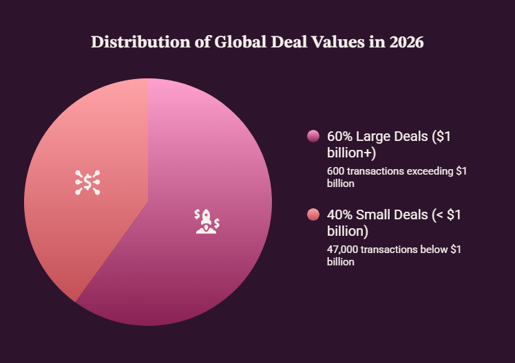
    This matters even more as deal activity rises. PwC says global deal values increased 36% in 2025, driven by about 600 transactions above $1 billion, while roughly 47,000 smaller transactions were flat year over year. 

    What are the common types of mergers and acquisitions?

    When people hear about a deal, they often look at the website before they read a full announcement. They want quick answers. Is the brand still active? Are the services changing? Who owns the company now? Can they still contact the same team?

    This is where design becomes communication. A clear page structure, simple navigation, helpful messaging, and visible support links can reduce doubt before it grows.

    Acquisition communication matters because changes can affect pricing, service delivery, product access, billing, and support paths. If the website does not answer those questions, customers may create their own story.

    That story is not always accurate.

    Practical Design Elements Reduce Confusion

    The key elements in this article are practical, not decorative. They focus on trust, clarity, search visibility, user experience, and long-term business confidence.

    Think about a regional software company joining a larger group. Existing customers may visit the site before calling sales or support. A strong transition page should explain the change, confirm service continuity, and show where to get help.

    That simple experience can protect confidence during a complex business moment.

    What Should a Merger or Acquisition Website Say First?

    Website visitors do not want vague language after a deal announcement. They want quick, direct answers.

    Nielsen Norman Group found 79% of users scan new web pages, while only 16% read word by word. 

    They want to know what happened, what will change, what will stay the same, and what they should do next.

    A merger or acquisition page should never hide basic information behind a press release. Press releases are helpful for media and investors, but they are not enough for customers who need practical guidance.

    A strong acquisition website strategy starts with the reader’s concern.

    Different groups will look for different answers:

    • Customers need reassurance about services, pricing, support, and account access.
    • Employees need clarity about the company direction and internal changes.
    • Partners need confidence that operations and relationships will continue.
    • Investors need a clear signal that the transition is being handled carefully.

    Each stakeholder may have a different concern, but they all need clear and consistent communication.

    The website should explain the transition in plain language. Avoid dramatic claims, vague promises, or complicated legal-style messaging.

    Instead, clearly explain:

    • What has changed
    • What has not changed
    • Who owns the company now
    • How customers can get support
    • Whether pricing, services, or accounts are affected
    • When people can expect the next update


    Useful website elements can include homepage announcement bars, FAQ sections, leadership notes, customer support links, contact paths, and service continuity messages.

    For example, a homepage banner could say:

    “Company A has joined Company B. Your current services and support contacts remain active. Learn what this means for customers.”

    That message is simple, calm, and helpful.

    The goal is a smooth transition, not a dramatic campaign. A good website helps people understand the next step without forcing them to search through emails, news articles, or legal pages.

    When the first message is clear, the rest of the transition becomes easier to trust.

    How Can Web Design Protect Trust After an Acquisition?

    Trust can drop after an acquisition if users feel ignored. Customers of the acquired company may worry about pricing, product quality, support access, roadmap changes, or whether familiar teams will still be available.

    That doubt is normal. A deal may be positive for the business, but customers usually care about how it affects their daily experience.

    Good web design can reduce dissatisfaction by making answers easy to find. Add transition FAQs, customer letters, service continuity notes, timeline sections, and clear support contact blocks.

    Protect Existing Brand Trust Before You Change Too Much 

    If the target company has strong customer loyalty, do not erase its identity too quickly. The website should respect the relationship people already have with the brand.

    This may mean keeping a dedicated transition page, using familiar product names, showing existing leadership, or explaining how the old and new teams will work together.

    The tone matters too. Do not speak only to investors. Speak to customers who may be worried about losing something they trusted.

    This connects directly to due diligence. Before an offer to purchase becomes public, teams should review customer concerns, high-value pages, brand equity, legal and regulatory limits, and support risks.

    That early review helps the website launch with fewer blind spots.

    For example, if customers often search for a legacy product name, removing that page too early can create confusion. A better approach is to keep the page, explain the transition, and guide users toward the right next step.

    Trust is protected when people feel informed, not surprised.

    How does branding and logo design impact mergers and acquisitions?

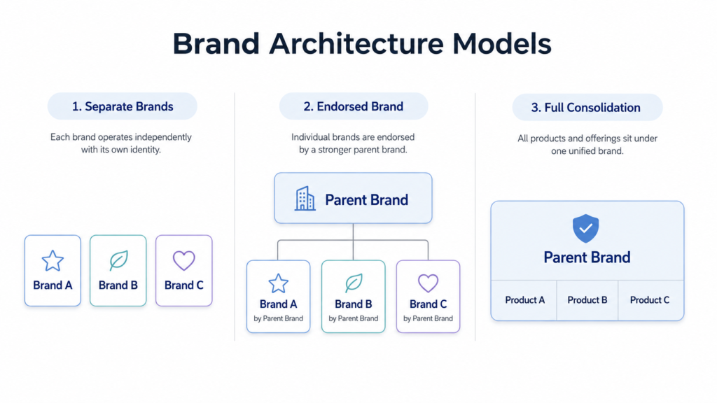
    Two companies need a clear brand architecture decision before design starts. They may keep separate brands, use an endorsed model, combine names, or form a new entity with a new company website.

    This decision shapes the full M&A website redesign. It affects navigation, homepage messaging, product pages, support paths, search visibility, and how customers understand the combined offer.

    Full consolidation can reduce redundancy and make the site easier to manage. It can also simplify content, service pages, analytics, and lead capture.

    Here is the rewritten version with bullets, without making it longer:

    Still, moving too fast can create risk.

    A slower transition may protect market share if users still search for the old brand or feel attached to the previous identity.

    In that case, the old site may need a transition page before full merger website consolidation.

    The right choice depends on:

    • Customer behavior
    • Brand equity
    • Search demand
    • Product overlap
    • Business goals

    When teams merge digital identities, visual elements matter because they guide recognition.

    This includes:

    • Logos
    • Colors
    • Typography
    • Navigation labels
    • Product categories
    • Page layouts

    For example, a banner can say, “Brand A is now part of Brand B.”

    A service page can explain what changed and where customers should go next.

    When merging with another brand, do not force users to guess.

    Good design should show whether the old brand is staying, being endorsed, or becoming part of a new entity.

    The goal is not only visual consistency. The goal is a website structure that helps people move from old familiarity to new clarity.

    Brand architecture for two companies after merger website consolidation.

    How does SEO and digital marketing play a role in M&A?

    Website design for mergers and acquisitions can damage SEO if migration is rushed. Old URLs, backlinks, metadata, ranking pages, and internal links may be lost when teams move, rewrite, or delete content.

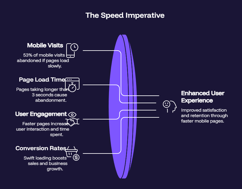
    • Google research says 53% of mobile visits are likely to be abandoned if pages take longer than 3 seconds to load.

    That can hurt visibility at the exact moment people are searching for answers.

    A clean M&A website redesign should include search planning from the beginning. Design teams should not decide page removal only by how a page looks. Some plain pages may carry strong rankings, backlinks, conversions, or customer support value.

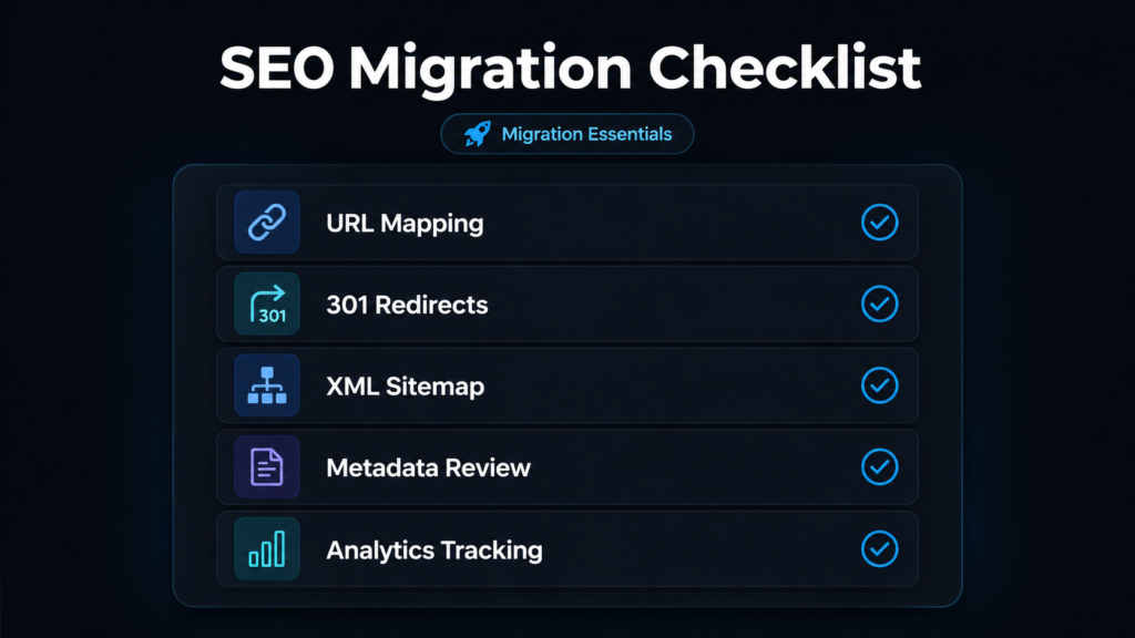
    What are the key considerations for website consolidation during an M&A?

    Start with a practical checklist.

    Map old URLs to new URLs. Keep valuable pages. Update titles and descriptions. Test redirects. Submit new sitemaps. Monitor analytics. Check search performance after launch. Review crawl errors. Keep transition content live long enough for users and search engines.

    The integration process should be simple to understand. A seamless experience keeps customers and search engines on the right path.

    If a product page moves, the old URL should guide people to the best new page. If a service name changes, the new page should explain the relationship clearly.

    This type of migration planning is a core part of the website strategy work delivered by Omnix Studio.

    Seamless integration does not mean everything changes overnight. It means every important page has a clear next destination, every major search path is protected, and every customer can still find what they need.

    SEO migration checklist for website design for mergers and acquisitions.

    What are the essential elements of a successful merger and acquisition?

    Be honest about the role of design. Website design does not replace discounted cash flow, future cash flows, or the target company’s financials. Those belong to valuation analysis.

    Still, a strong website can support confidence in how the business is positioned.

    Clear offers, proof, customer stories, fast pages, and strong service structure can suggest operational maturity. These signals may help buyers, partners, and customers understand the business more quickly.

    This does not mean design alone creates profitability. It does not.

    But design can make the value story easier to understand.

    For example, if a company has strong customer outcomes but poor service pages, the value may be harder to see. A clearer website can show who the business serves, what problems it solves, and why customers trust it.

    That can support buyer confidence during review, planning, and post-close communication.

    Synergy should also be handled carefully. If the deal thesis depends on cross-selling, new markets, or stronger services, the website should explain that synergy in plain language.

    Avoid inflated promises like “industry-leading transformation” unless there is proof behind it.

    A better message would be: “Our combined company now offers strategy, implementation, and ongoing support through one connected team.”

    That is specific, useful, and easier to believe.

    When the website explains service expansion, customer benefits, and operational clarity, it can support valuation perception.

    It helps people understand the business story faster.

    What are the basic tenets for effective website design?

    Professional services websites depend heavily on trust. After a merger or acquisition, clients want to know who leads the work, whether their advisors remain, and how the team of experts will guide the process.

    This is not only a design issue. It is a relationship issue.

    Clients often choose firms because of people, expertise, reputation, and confidence. If the website suddenly changes names, pages, or contact paths without explanation, clients may feel disconnected from the firm they trusted.

    The most useful pages are often simple:

    • Leadership pages
    • Service pages
    • Industry pages
    • Case studies
    • Contact paths
    • FAQ sections

    These pages clarify roles and responsibilities and make the new organization structure easier to understand.

    These pages clarify roles and responsibilities and make the new organization structure easier to understand.

    For example, if an accounting firm acquires a tax advisory practice, the website should show expanded services, continuity of people, client contact points, and benefits.

    The tone should not sound like a generic announcement. It should speak directly to clients.

    A useful message might say: “Your existing advisory team remains in place. You now have access to broader accounting, tax, and business support through one connected firm.”

    That gives clients confidence without overselling the change.

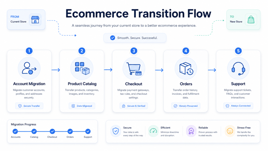
    What Changes for Ecommerce During an Acquisition Website Redesign?

    Ecommerce changes are sensitive because customers use accounts, checkout, shipping, returns, subscriptions, loyalty points, and order history.

    When one company buys another company, the website must make practical changes easy to understand.

    A customer does not want a long business explanation before buying again. They want to know if their login still works, where their order history lives, whether returns are accepted, and how loyalty points are handled.

    During an acquisition website strategy, teams should explain company purchases, product catalog changes, account migration, support updates, and checkout continuity.

    If the buyer is acquiring a new store or another business, customers need simple instructions before they place another order.

    This matters even more when another company has different policies, shipping rules, product data, or support standards.

    For example, a transition page can answer: “Do I need to create a new account?” “Where can I track my order?” “Will my subscription continue?” “Who handles returns now?”

    Align Operations Before Promising Cost Savings

    Cost savings should also be discussed carefully.

    Ecommerce consolidation may create operational efficiencies and cost savings, but only when product data, inventory, tracking, checkout, and customer support are aligned before launch.

    If these systems are rushed, the website may look finished while the customer experience breaks behind the scenes.

    Ecommerce acquisition website redesign with checkout and account transition planning.

    What are the essential phases or steps in the web design process?

    A new website should not start with colors. It should start with careful planning across a few important areas:

    • Audience research and customer concerns
    • Service mapping and content review
    • Analytics, SEO risk, and old URL priorities
    • Legal and regulatory review
    • Customer support needs before and after launch

    Design comes later because the structure must first answer real business questions.

    Design comes later because the structure must first answer real business questions.

    What are customers worried about? Which pages drive leads? Which services are changing? Which teams own updates? Which old URLs need to stay live? Which pages need approval from legal, sales, product, or support?

    Website design for mergers and acquisitions should be tied to an integration plan.

    A well-executed integration plan gives every team clear ownership before launch. Marketing owns messaging. Sales owns lead flow. Support owns customer questions. Development owns technical changes. Leadership approves the transition story.

    That ownership helps the site operate more efficiently after launch.

    It also helps teams navigate the complexities of timing, customer communication, search risk, and internal alignment.

    For the merged company, long-term success comes from post-launch updates, analytics reviews, support feedback, and organizational ownership.

    A website should not freeze after the announcement period ends.

    The first version may answer the most urgent questions. The next version should improve service pages, content depth, conversion paths, proof, and post-merger website integration.

    A strong website keeps learning from customers after the deal is public.

    How Do You Measure Success After a Merger or Acquisition Website Launch?

    Launch is not the finish line. After the new site goes live, teams should track branded search, organic traffic, form submissions, support tickets, page speed, lead quality, conversion paths, and engagement on key transition pages.

    This helps teams see whether the website is reducing confusion or creating more questions.

    Measurement also connects the website to successful m&a. A strong digital transition should help teams identify opportunities for growth, reduce customer confusion, enhance operational efficiency, and capitalize on the stronger combined offer.

    Website performance should not be reviewed only by the design team. Sales, support, leadership, marketing, and operations should all share feedback.

    For example, if support tickets increase around account access, the website may need clearer login instructions. If branded search drops, transition pages and redirects may need review.

    Use a simple 30, 60, and 90-day review cycle:

    • First 30 days: Check technical issues, redirects, support questions, and conversion paths.
    • At 60 days: Review organic traffic, content gaps, customer behavior, and lead quality.
    • At 90 days: Optimize weak pages, update FAQs, improve service pages, and adjust messaging based on real user data.

    This keeps the website connected to m&a integration, not only launch-day design.

    The best teams treat m&a activities as an ongoing improvement cycle. They measure, learn, and refine until the website supports customers, teams, and business goals with less friction.

    Final Thoughts

    A merger or acquisition website should do more than announce a deal. It should help customers, employees, partners, and investors understand what changed and what happens next.

    The strongest transition websites focus on clarity before creativity. They answer customer questions, protect trust, preserve SEO value, and make important changes easy to navigate. From brand architecture and messaging to account management and support paths, every decision should reduce confusion rather than create it.

    A well-designed website can also strengthen how people perceive the combined business, although it cannot replace financial analysis or valuation work. Long-term success comes from clear ownership, ongoing optimization, and a commitment to improving the experience after launch.

    Ultimately, the goal is not simply to launch a new website. The goal is to create a confident digital transition that helps people trust, understand, and engage with the business moving forward.

    Ready to Plan Your M&A Website With More Clarity?

    Planning a merger, acquisition, or website consolidation?

    Omnix Studio can help you build a clear M&A digital strategy, protect search visibility, improve user experience, and plan post-merger website updates with confidence.

    You get a strategist, designers, and developers working together so the site does more than look polished. It supports trust, clarity, conversion, and growth.

  • Inside a Web Design Agency: How Web Designers Sketch Your Vision

    Inside a Web Design Agency: How Web Designers Sketch Your Vision

    A great website rarely starts with polished screens, colors, or fancy animations. It starts with a conversation. Designers first understand your business, your audience, and what the website needs to achieve. Then they slowly turn those ideas into sketches, wireframes, and a visual experience that feels right.

    TL;DR

    • A strong website begins with a clear brief, not a blank canvas.
    • Clients can speed up the process by explaining goals, audience, pages, and brand direction early.
    • AI can help you explore ideas, sketch rough concepts, and prepare a better brief before meeting designers.
    • Web designers use sketches and wireframes to turn abstract ideas into practical layouts.
    • A good agency process reduces guesswork, saves revision time, and leads to a stronger final website.

    How to Instruct a Web Design Agency About Your Website Vision

    Before a designer can shape your website, they need to understand what is already in your head. Many clients come in with a vague line like, “I want something modern.” That is a start, but it is not enough to build from.

    A better brief helps the agency think faster, explore better ideas, and avoid unnecessary back-and-forth.

    Explain What Your Business Does Clearly

    Start with the basics. What do you sell? Who do you help? Why should someone choose you over another option?

    A design agency is not only decorating a page. They are shaping how visitors understand your business. If the team misses your positioning, the website may look polished but still feel disconnected from your brand.

    Share things like:

    • Your core products or services
    • Your ideal customers
    • Your unique value
    • Your market position
    • The kind of trust you want to build

    The clearer this is, the stronger the design direction becomes.

    Share the Main Goal of the Website

    Every website should have a purpose. Without one, the design can become visually attractive but strategically weak.

    Tell the agency what success looks like. For example:

    • Generate more consultation requests
    • Sell products directly
    • Showcase a portfolio
    • Build brand credibility
    • Increase newsletter signups
    • Explain a complex service in a simpler way

    Once the goal is clear, designers can prioritize layout, content sections, and calls to action around it.

    Describe Your Target Audience

    Your website should not only reflect your taste. It should make sense to the people visiting it.

    Tell the agency who they are designing for. A website for a luxury architecture firm will not feel like a website for a startup SaaS tool. The same principle applies to almost every business.

    Mention:

    • Age group or profession, if relevant
    • Their buying intent
    • Their common questions
    • Their biggest frustrations
    • What they need to trust you

    This helps designers decide how bold, simple, premium, playful, or conversion-focused the design should feel.

    Use AI to Explore and Sketch Your Website Idea First

    Before sending a formal brief to a web design agency, spend some time chatting with an AI tool. Explain your business, audience, services, and website goal. Then ask it to help you shape the idea.

    You can ask AI to:

    • Suggest homepage sections
    • Recommend a page structure
    • Draft a basic website brief
    • Clarify user flow
    • Generate layout ideas
    • Create a rough visual concept or sketch

    This does not replace a professional designer. It simply helps you arrive better prepared.

    Instead of saying, “I need a website, but I am not sure how it should look,” you can say, “Here is the direction I explored. Can you refine this into a stronger design system?”

    That small shift can save a surprising amount of discovery time. Designers spend less energy decoding an unclear idea and more time improving one that already has shape.

    Provide Brand Assets and Existing Guidelines

    If you already have brand materials, share them early. These help the agency keep the website consistent with the identity you have built.

    Useful assets include:

    • Logo files
    • Color palette
    • Typography preferences
    • Brand guidelines
    • Photography style
    • Existing social or print materials

    Even when the agency plans to refresh your visual direction, seeing the current brand helps them understand what should stay and what should evolve.

    Show Website Examples You Like and Dislike

    References are incredibly useful. They help designers understand your taste faster than adjectives alone.

    Share websites you like and explain why. Maybe you appreciate the clean hero section, the spacing, the storytelling, or the interactive product blocks. Also show examples you dislike and say what feels off.

    That feedback helps eliminate wrong directions early.

    A simple comment like, “I like this layout but not this color treatment,” gives more clarity than, “Make it premium.”

    Clarify the Pages and Features You Need

    Designers also need to understand scope. A five-page service website and a content-heavy marketplace do not follow the same planning process.

    Mention the pages you expect, such as:

    • Homepage
    • About page
    • Service pages
    • Pricing page
    • Blog
    • Contact page
    • Landing pages

    Also include functionality such as:

    • Booking form
    • eCommerce flow
    • Search
    • Customer portal
    • Case study layout
    • Newsletter signup
    • Interactive calculators

    This prevents scope surprises later and gives designers a proper canvas to think within.

    Share Content and Conversion Priorities

    Design is closely tied to content. A section that looks elegant with one short paragraph may feel crowded with six paragraphs and three buttons.

    Tell the team what messages matter most. Which offer needs to stand out? Which proof points need visibility? What action should users take after reading the page?

    Useful notes include:

    • Main headline ideas
    • Primary call to action
    • Important trust signals
    • Testimonials or case studies
    • Must-show product benefits
    • Any content that cannot be removed

    The more designers know about content priority, the better they can create a meaningful visual hierarchy.

    Be Honest About Budget, Timeline, and Flexibility

    Budget and deadlines influence design decisions. A tight launch window may call for a focused, efficient scope. A longer timeline may allow more iterations, deeper research, and a richer UI system.

    Being open early helps the agency guide you realistically. It also prevents the project from moving in a direction that does not fit the actual resources available.


    What Happens Before the First Sketch?

    Once the brief is clear, the agency starts translating it into a design process. This is where strategy begins to shape structure.

    Designers do not usually jump into polished visuals right away. They first study the business, the users, and the journey the site needs to create.

    Understanding the Client’s Business

    A good designer asks business questions before design questions.

    They want to know:

    • What problem you solve
    • What your visitors are trying to achieve
    • Which services or products matter most
    • Where users often get confused
    • What kind of action the website should drive

    This gives the design more depth. Every page section begins to serve a reason.

    Defining Website Goals

    The project goal affects almost every visual decision.

    A lead generation website may emphasize forms, testimonials, and trust-building copy. An eCommerce site may prioritize product discovery, comparison, and frictionless checkout pathways.

    When the goal is clearly defined, the page has direction. Without it, the layout can feel like a collection of nice-looking blocks with no real purpose.

    Collecting Inspiration and References

    Agencies often create a reference board before sketching. This may include competitor websites, moodboards, user interface examples, typography ideas, or interaction styles.

    The point is not to copy. It is to define a visual territory.

    Are we moving toward clean and editorial? Bold and futuristic? Warm and personal? Minimal and premium?

    These early references help align everyone before deeper design work begins.


    Turning Ideas Into a Clear Website Direction

    Once the agency understands the business and goals, they begin shaping the website structure. This is where raw information becomes an experience.

    Mapping the Website Structure

    Before sketching individual screens, designers often help define the information architecture. In simple terms, that means deciding what lives where.

    They organize:

    • Navigation menu
    • Page relationships
    • Section order
    • Content priorities
    • Conversion points

    A strong structure helps visitors move naturally through the website without feeling lost.

    Planning the User Journey

    Great web design is not only about how the page looks. It is also about what happens next.

    Designers ask:

    • What should the user notice first?
    • What question appears in their mind next?
    • What proof do they need before acting?
    • Where should the next click happen?

    This is how visual design begins to support decision-making.

    For example, a service business homepage may move from pain point to promise, then proof, then process, then call to action. That order feels intuitive because it follows how people build trust.


    The First Visual Step: Sketching the Website

    Now the design team starts putting ideas onto a canvas. This may happen on paper, a tablet, or inside a design tool using simple blocks.

    The sketch is not meant to impress anyone. It is meant to reveal structure.

    Why Designers Start With Rough Sketches

    Sketching allows designers to think quickly. They can test multiple layouts without wasting time perfecting details too early.

    A rough homepage sketch might explore:

    • Where the headline should sit
    • Whether the image should appear left or right
    • How many service cards fit naturally
    • Where testimonials should appear
    • How the call to action can stand out

    This phase creates options before commitment.

    What a Website Sketch Usually Includes

    A basic website sketch often maps the core building blocks of a page.

    That may include:

    • Hero section
    • Navigation bar
    • Intro copy
    • Feature or service blocks
    • Social proof
    • CTA sections
    • Footer structure

    Even in rough form, these elements reveal whether the page feels balanced and logical.

    How Sketches Help Align Client Vision

    This step is especially useful because it makes the invisible visible.

    A client may imagine “something clean and simple,” while the designer may interpret that in several ways. Once a sketch appears, both sides can react to the same object instead of talking in abstract terms.

    That lowers confusion and improves collaboration early.


    From Sketches to Wireframes

    After the rough ideas feel promising, designers move into wireframes. These are clearer blueprints of the website layout.

    Wireframes are still not final visual designs. They focus on structure, content placement, and interaction logic.

    What Is a Wireframe?

    A wireframe shows how a page is organized without the distraction of full branding. It answers questions like:

    • What content appears first?
    • How is information grouped?
    • Where do forms, cards, images, and buttons live?
    • What needs more visual weight?

    Think of it as the architectural plan before interior design begins.

    Low-Fidelity vs High-Fidelity Wireframes

    Low-fidelity wireframes are simple. They may use gray boxes, placeholder lines, and basic labels.

    High-fidelity wireframes become more detailed. They may show realistic spacing, content density, interaction states, and stronger screen logic.

    Agencies choose the level based on project complexity. A larger platform may need more precise wireframes than a straightforward brochure site.

    Why Wireframes Matter in Agency Projects

    Wireframes prevent expensive surprises later.

    If the structure is weak, changing it after full UI design takes more effort. By solving layout and hierarchy early, the team avoids reworking polished screens unnecessarily.

    This helps:

    • Shorten revisions
    • Improve user flow
    • Clarify project scope
    • Create smoother handoff to developers

    Wireframes are one of the quiet heroes of efficient website design.


    Building the Visual Mood of the Website

    Once the page structure is clear, the agency starts shaping the visual personality. This is the moment where the site begins to feel like your brand.

    Creating Moodboards and Style Direction

    A moodboard is a curated collection of visual references. It may include:

    • Color combinations
    • Font pairings
    • Button treatments
    • Illustration style
    • Photography approach
    • Interface inspiration

    Moodboards help answer the question, “What should this website feel like?”

    A legal firm may need trust and restraint. A creative studio may need more movement and personality. A SaaS product may need clarity, confidence, and polish.

    Matching Design Style With the Brand

    Style should grow from strategy. It should not be chosen because something looked trendy on another site.

    Designers look at:

    • Brand personality
    • Industry expectations
    • Audience sensitivity
    • Positioning
    • Conversion goals

    That is how they decide whether the website should feel elegant, technical, friendly, editorial, playful, bold, or highly minimal.


    Bringing the Vision to Life With UI Design

    With the wireframe approved and the style direction selected, the agency starts creating high-fidelity UI screens.

    Now the website begins to look real.

    Turning Wireframes Into Polished Screens

    This stage adds:

    • Colors
    • Typography
    • Icons
    • Visual rhythm
    • Image direction
    • Buttons and form styling
    • Responsive considerations

    Designers turn structural boxes into a carefully crafted user interface. Every spacing decision, font scale, and color contrast plays a role in readability and perception.

    Designing for Both Beauty and Clarity

    A visually impressive site is not automatically a useful one. Good design balances beauty with function.

    The visitor should understand:

    • Who you are
    • What you offer
    • Why it matters
    • What to do next

    If the page is beautiful but confusing, it fails. Strong designers know how to keep aesthetics and clarity working together.

    Making the Design Responsive Early

    People may visit your site from a desktop monitor, a tablet, or a phone during a commute. The layout has to work across all of them.

    Responsive design is not a final cleanup task. It should be considered throughout the process.

    Designers think about:

    • How navigation collapses
    • How image-heavy sections stack
    • How buttons appear on smaller screens
    • Whether text stays readable
    • Whether forms remain easy to complete

    A concept that only works on desktop is not a finished idea.


    Feedback, Revisions, and Refinement

    Design projects become stronger through thoughtful feedback. The key word is thoughtful.

    Useful feedback keeps the project moving. Vague feedback slows everything down.

    How Agencies Present Design Concepts

    A good agency does more than send a screenshot and ask, “Thoughts?”

    They explain:

    • Why the layout was structured this way
    • How the design supports the business goal
    • Why certain elements receive more emphasis
    • How the page guides users toward action

    That context helps clients respond with better feedback.

    What Good Client Feedback Looks Like

    The most helpful feedback connects to outcomes.

    For example:

    • “The homepage feels trustworthy, but the service offering is not obvious enough.”
    • “Can the CTA appear sooner? Lead generation is our main goal.”
    • “This visual direction is strong, but we want the brand to feel warmer.”

    That is much more useful than, “Can you make it pop?”

    How Revisions Sharpen the Final Website

    Revisions are not a sign that the project is failing. They are part of refinement.

    The best revisions improve:

    • Message clarity
    • Visual balance
    • Content hierarchy
    • Conversion flow
    • Brand fit

    When both sides stay aligned on goals, revisions make the website sharper rather than more complicated.


    Beyond the Sketch: Preparing for Development

    Once the design is approved, the agency prepares it for implementation. This handoff matters because even the best design can break down if developers do not receive clear direction.

    Creating a Developer-Ready Design Handoff

    The design team typically prepares:

    • Final screen layouts
    • Responsive variants
    • Components
    • Design tokens or styles
    • Hover states
    • Form states
    • Exported assets
    • Spacing and behavior notes

    The clearer this handoff is, the easier it becomes to build the website accurately.

    Why a Strong Design Process Makes Development Easier

    When strategy, sketches, wireframes, and UI are handled properly, development becomes smoother.

    There are fewer assumptions. Fewer “what did this mean?” questions. Fewer last-minute layout changes.

    That means:

    • Faster implementation
    • Better consistency
    • Less rework
    • A website that stays closer to the original vision

    The design process pays off long before launch day.


    What Clients Gain From This Process

    A structured web design process benefits the client as much as the agency.

    A Website That Reflects the Brand

    The final site feels intentional, not assembled from random inspiration. It communicates the business in a clearer, more memorable way.

    A Clearer Path for Visitors

    Users understand where to look, what to read, and what to do next. That makes the website more effective.

    Fewer Costly Changes Later

    Because early concepts are tested before final design, major structural mistakes are caught sooner. This reduces time-consuming revisions.

    A Final Design Built With Purpose

    Every section has a job. Every screen supports a larger goal. The website becomes more than a digital brochure. It becomes a tool for communication and growth.


    Final Thoughts

    Inside a web design agency, the finished website is only the final layer of a much deeper process. Designers listen, question, sketch, test, refine, and translate a business idea into a visual experience people can understand.

    Clients play an important role in that journey too. The clearer the brief, the stronger the outcome. And with AI now helping clients brainstorm and sketch early ideas, the whole collaboration can start from a much better place.

    A good website is not created in one brilliant moment. It is shaped step by step, until the original vision finally becomes something visitors can see, use, and trust.


    Frequently Asked Questions

    Do web designers always sketch before creating a website?

    Not always on paper, but most designers explore rough layout ideas before moving into polished UI. Sketches help them test structure quickly and avoid rushing into visual details too soon.

    What is the difference between a sketch and a wireframe?

    A sketch is a fast, rough idea of layout. A wireframe is a more organized blueprint that shows page structure, content placement, and user flow more clearly.

    Why should clients prepare a detailed design brief?

    A clear brief helps the agency understand the business, goals, audience, required pages, and visual preferences. That reduces confusion and helps the design process move faster.

    Can AI help before hiring a web design agency?

    Yes. AI can help you clarify ideas, explore page structures, draft a creative brief, and even sketch rough concepts. It is useful for preparation, but professional designers still refine the final direction.

    Why do agencies create moodboards?

    Moodboards help define the visual tone of a website before final design begins. They align everyone on colors, typography, imagery, and overall brand feeling.

    How does a website move from idea to final design?

    The usual flow is discovery, briefing, references, sketches, wireframes, moodboards, high-fidelity UI design, revisions, and development handoff.

    Need Great Designe for your Website?